FIRST STEPS
WHAT IS GOOD360?
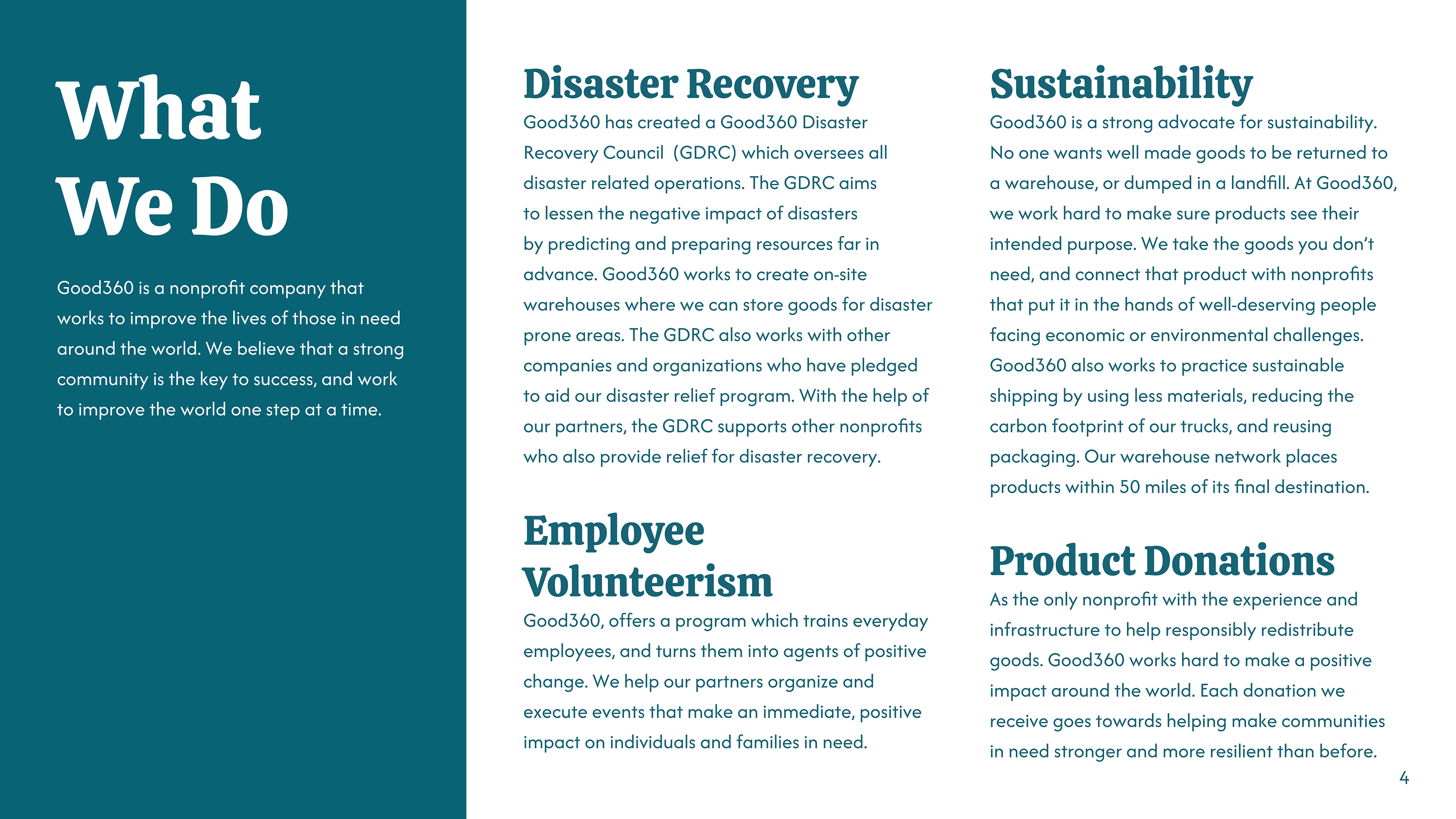
Good360 links communities facing hardship with the vital supplies they need, enabling businesses to donate surplus products responsibly. With the help of dedicated donors, Good360 swiftly delivers these goods to where they can make the greatest impact, working through a network of over 100,000 nonprofit organizations. By addressing unmet needs, Good360 strengthens communities, cuts down on waste, and ensures essential items reach those who need them most.
PROJECT DESCRIPTION
This project was a comprehensive rebranding, we were expected to create a sample brand book that showcases strategy, branding, visual identity, and implementations for the client. We were essentially overhauling the client's existing brand identity and creating an entirely new one to present to the client.
MY ROLE
I took on the role of a Graphic Designer and creative head for this project. I managed the entire creative overhaul of the pre-existing brand and formulated the sample brand book. I also created mock-ups representing ways the company could use its new branding to advertise.
RECREATING THE LOGO
BIG CHANGES
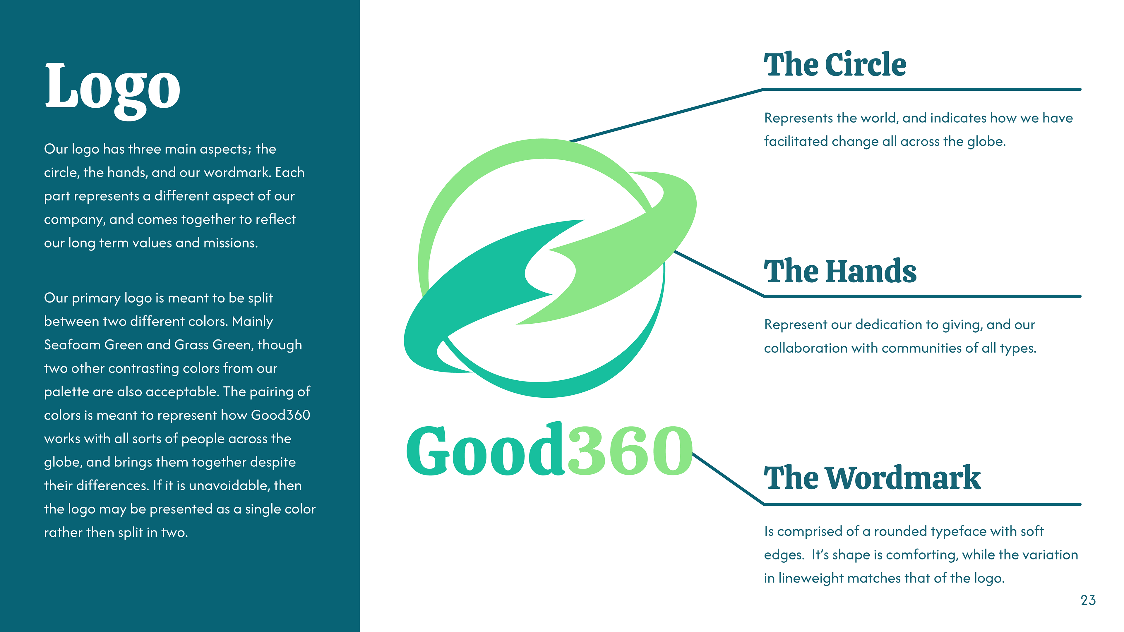
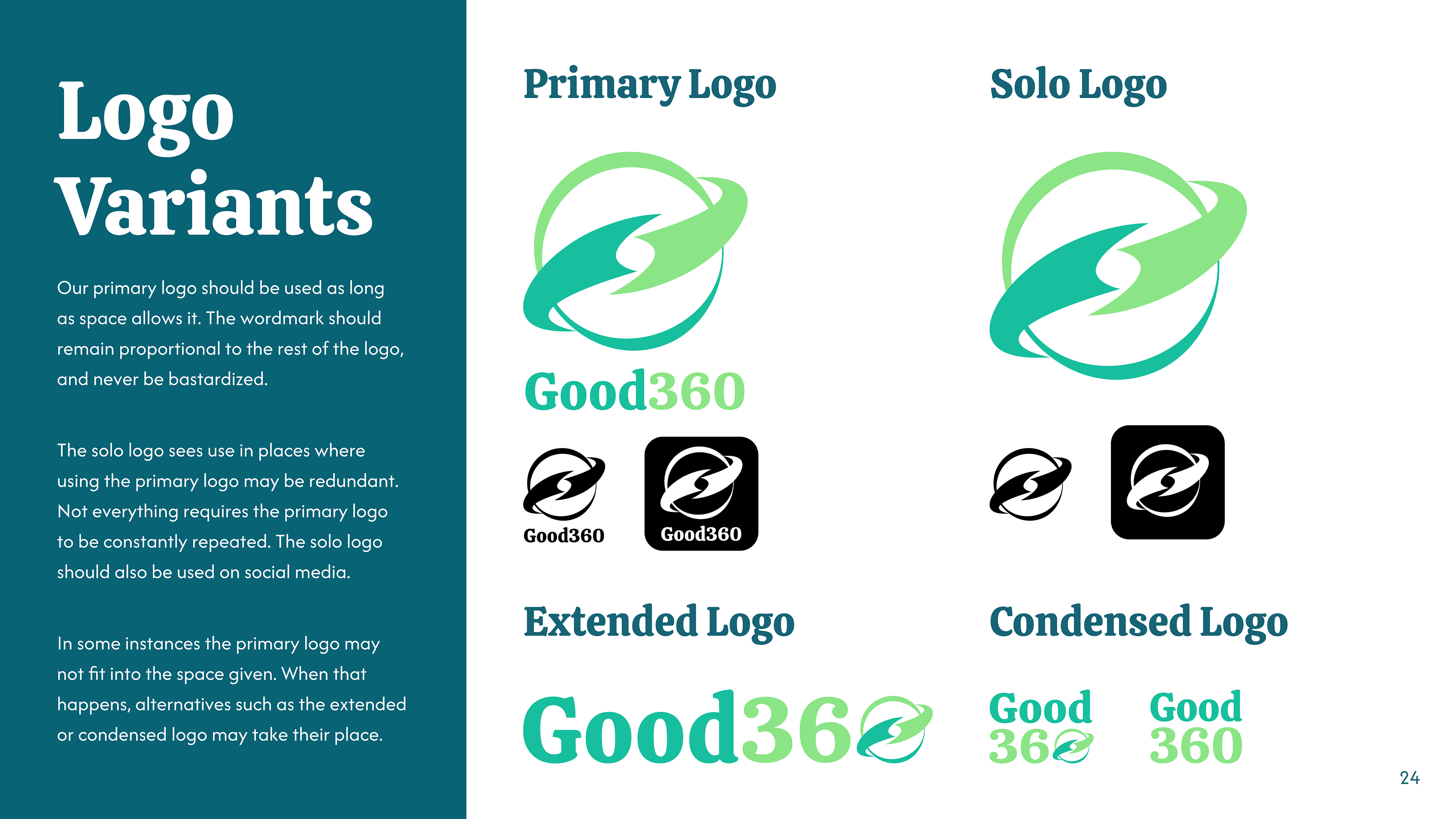
I began by overhauling their previous logo as it was ineffective. The original logo was grey on light green; it had no contrast and barely stood out against lighter backgrounds. The main logomark was a stylized "G" that looked more like the power symbol on computers than anything else. I wanted a logomark that would stand out, have good contrast, and truly encompass what Good360 represented.
ESTABLISHING BRAND IDENTITY
CLICK HERE TO VIEW THE COMPLETE BRAND BOOK
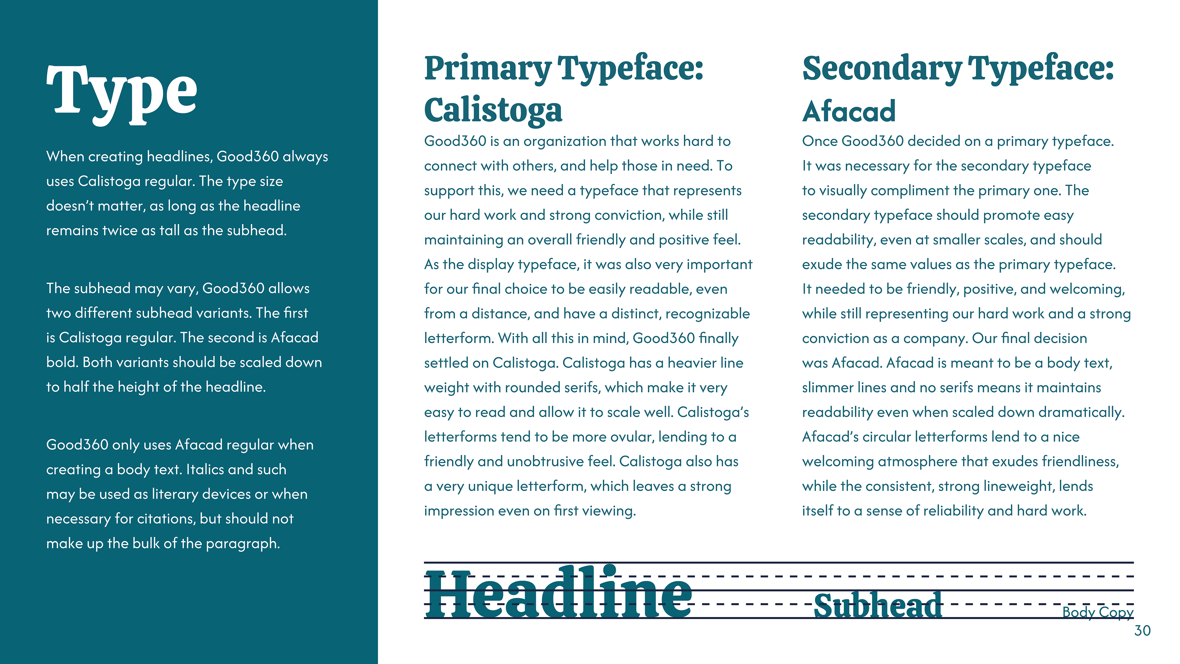
COLOR & TYPE
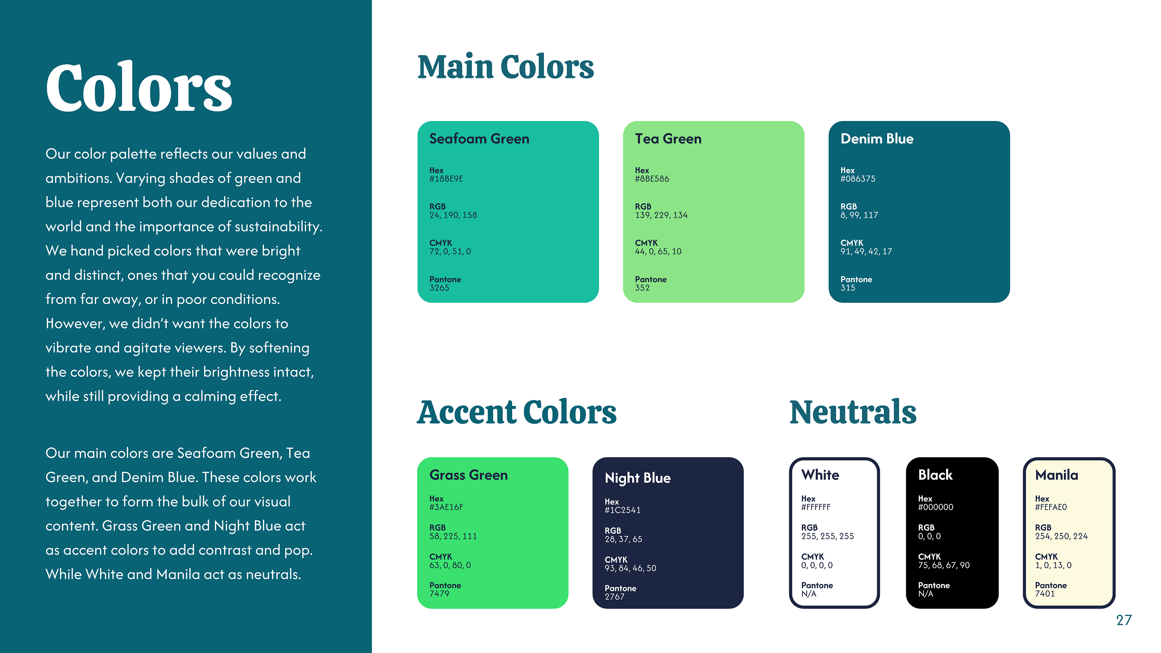
It was important for the colors to mirror the brand. Good360 strongly advocates for environmental sustainability, and they operate globally to help those who suffer from natural disasters. To reflect this, I chose varying shades of green and blue. I avoided choosing colors that were oversaturated or bright, I wanted the brand to have a calming, soothing feel.
DEVELOPING THE MARKETING CAMPAIGN
GENERATING INTEREST
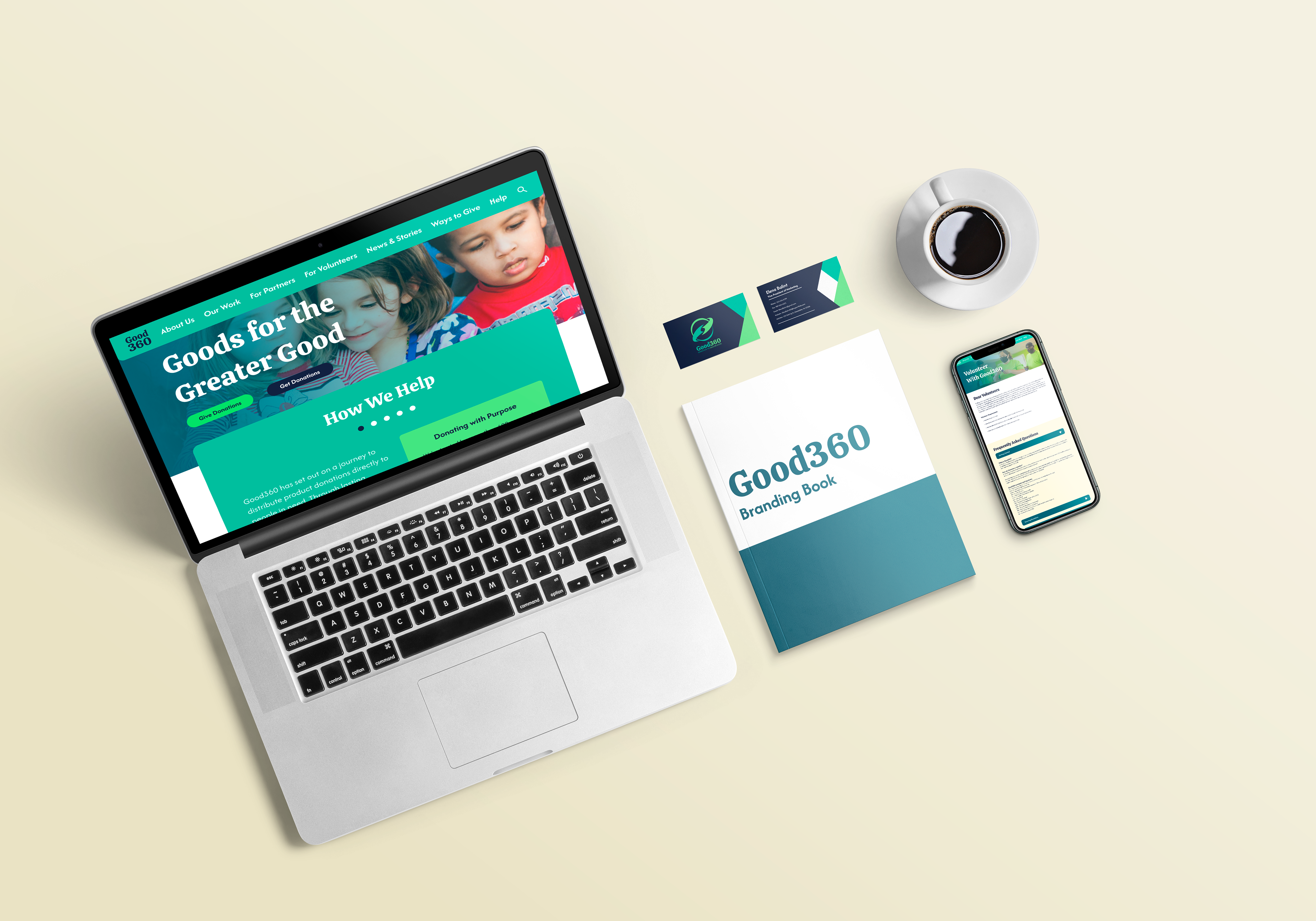
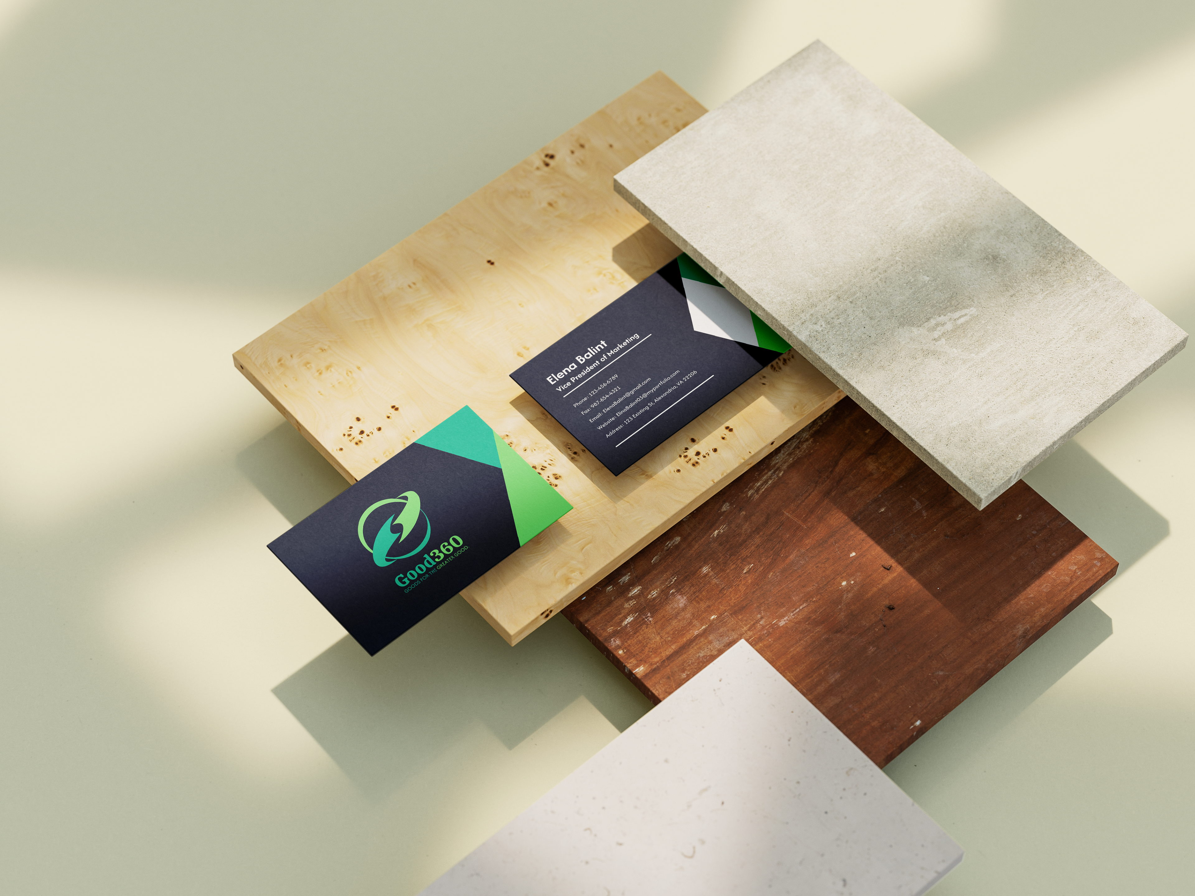
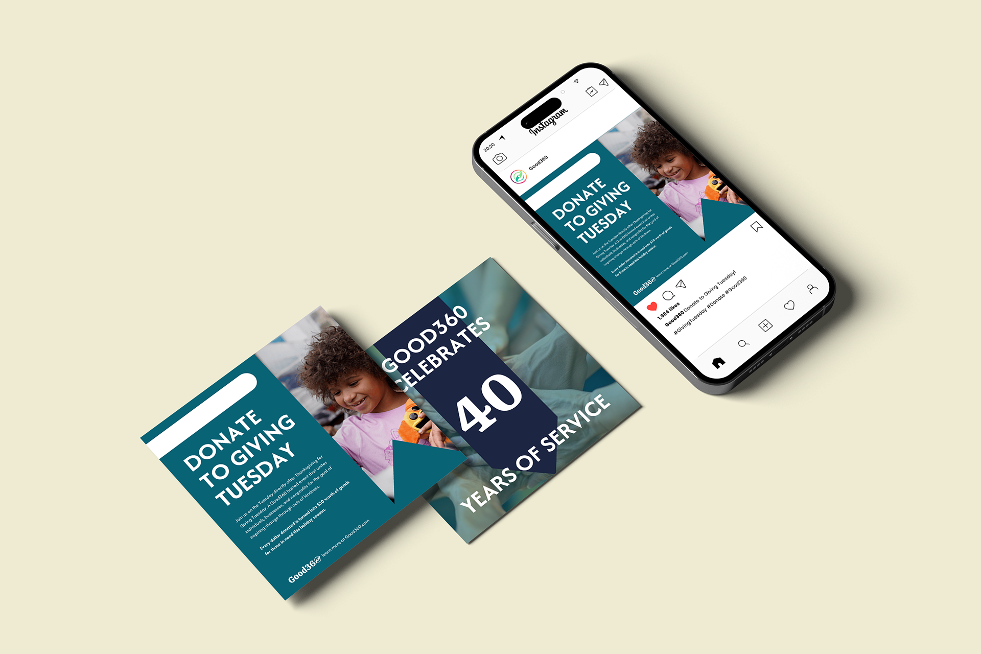
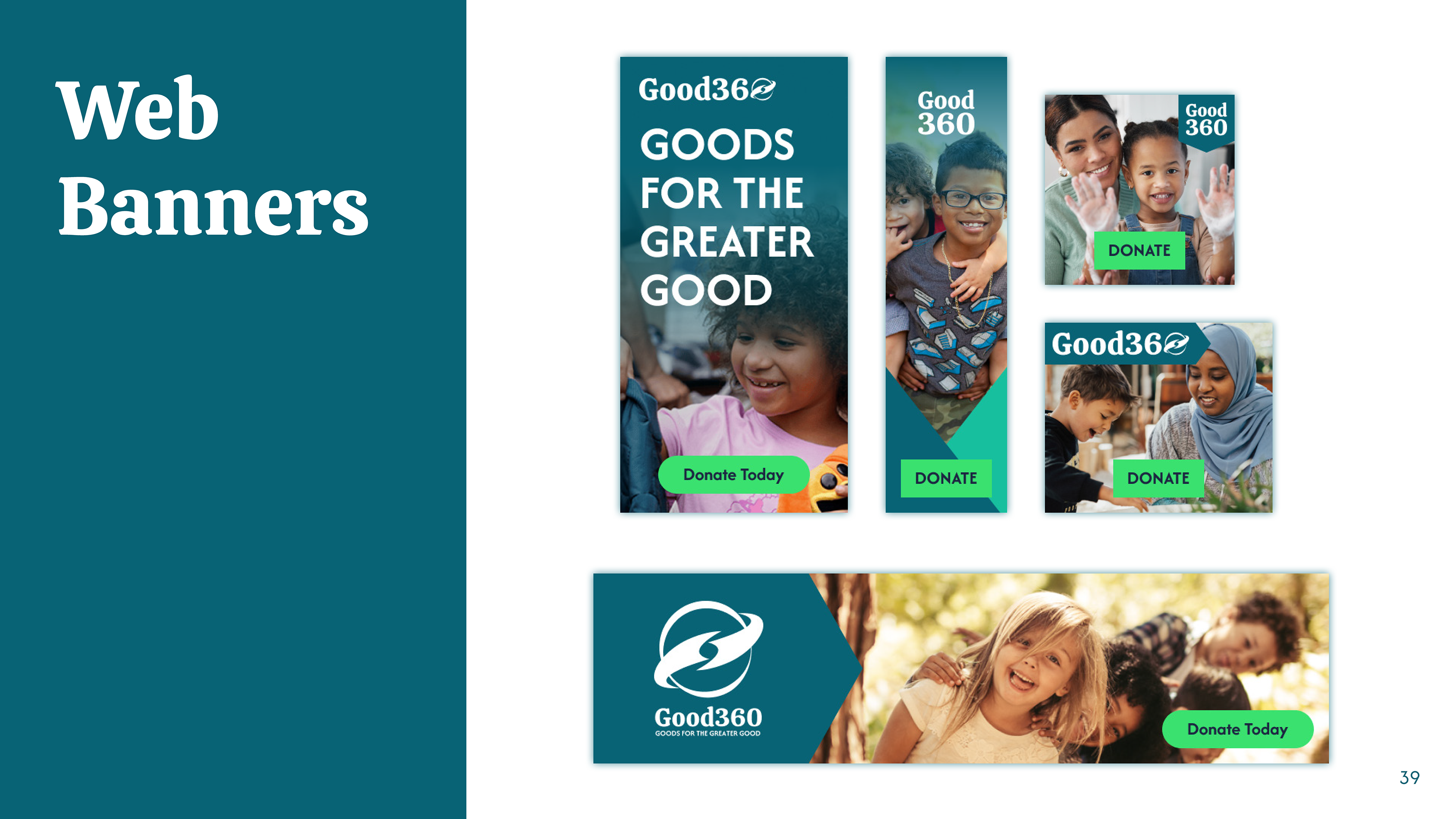
Good360 is a brand that relies heavily on donations to make a difference. The company needs to reach as many people as possible and build a positive reputation. Due to this, it's important to have a strong digital presence. With this in mind, I focused heavily on digital aspects such as social media posts, web banners, and a revamp of the website. In an effort to appeal to our corporate partners, I also designed a business card to improve networking.
DESIGNING THE WEBSITE
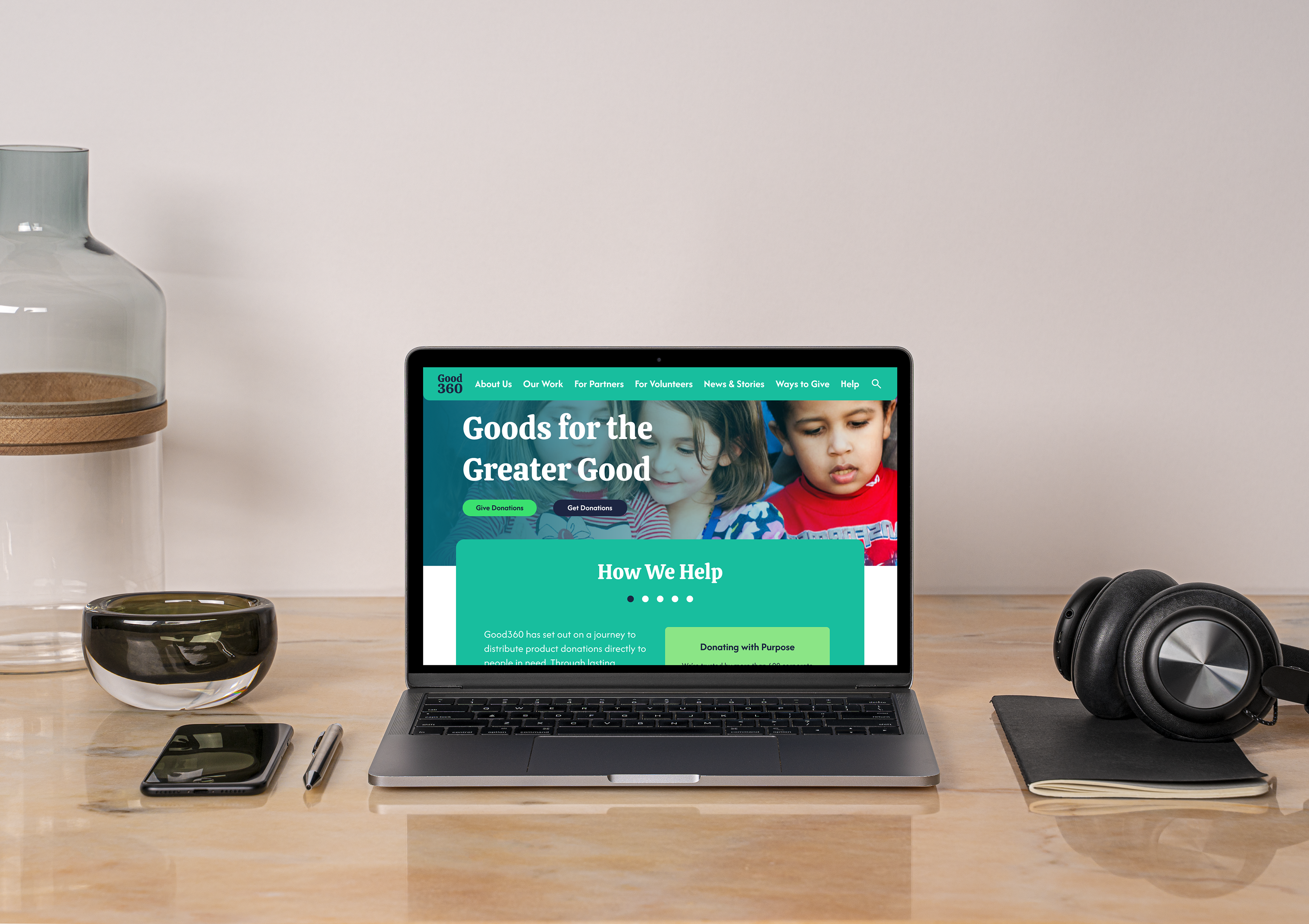
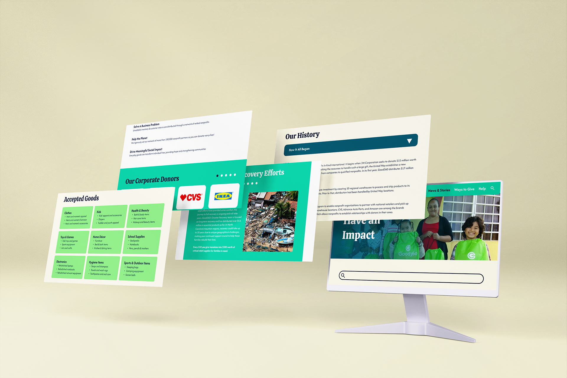
CALL TO ACTION
With the main touchpoint of Good360 being their website, I knew I would have to redesign it entirely. It needed to be as straightforward as possible, with ample spacing and more visuals. It was important to place a call to action on almost every page to push people to donate, volunteer, or make an impact in another way.