FIRST STEPS
WHAT IS HARMONY?
Harmony is a company dedicated to making a lasting, positive impression on its customers and the world around us. Harmony strives to make delicious, healthy juice that people of all ages can enjoy. Whether it's on the go or as a delicious treat. Harmony wants what’s best for you and the people you support. After all, harmony is better together.
PROJECT DESCRIPTION
For this project, the client requested that we develop a unique name, brand, and packaging for their new juice to help them stand out in the current market. They wanted to market their product as a niche in the industry. We would present an example product to them before moving on to development.
MY ROLE
I served as a Graphic Designer and creative head for this project. I conducted research to determine what niche the brand would fill and developed the new brand identity. I also designed custom packaging and created marketing samples.
CONDUCTING RESEARCH
COMPANY GOALS
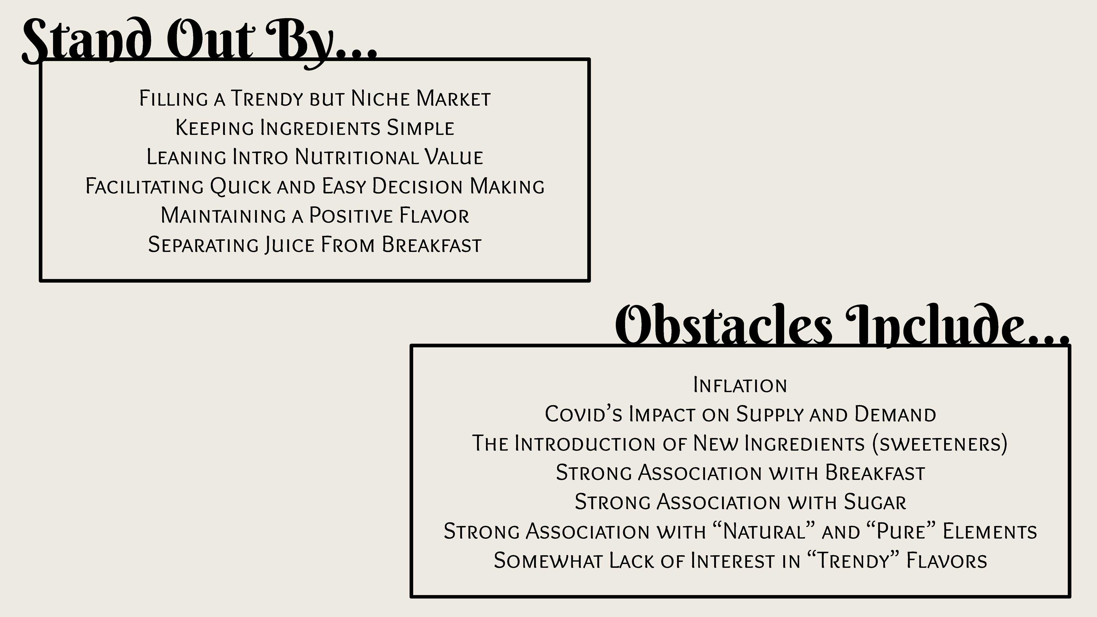
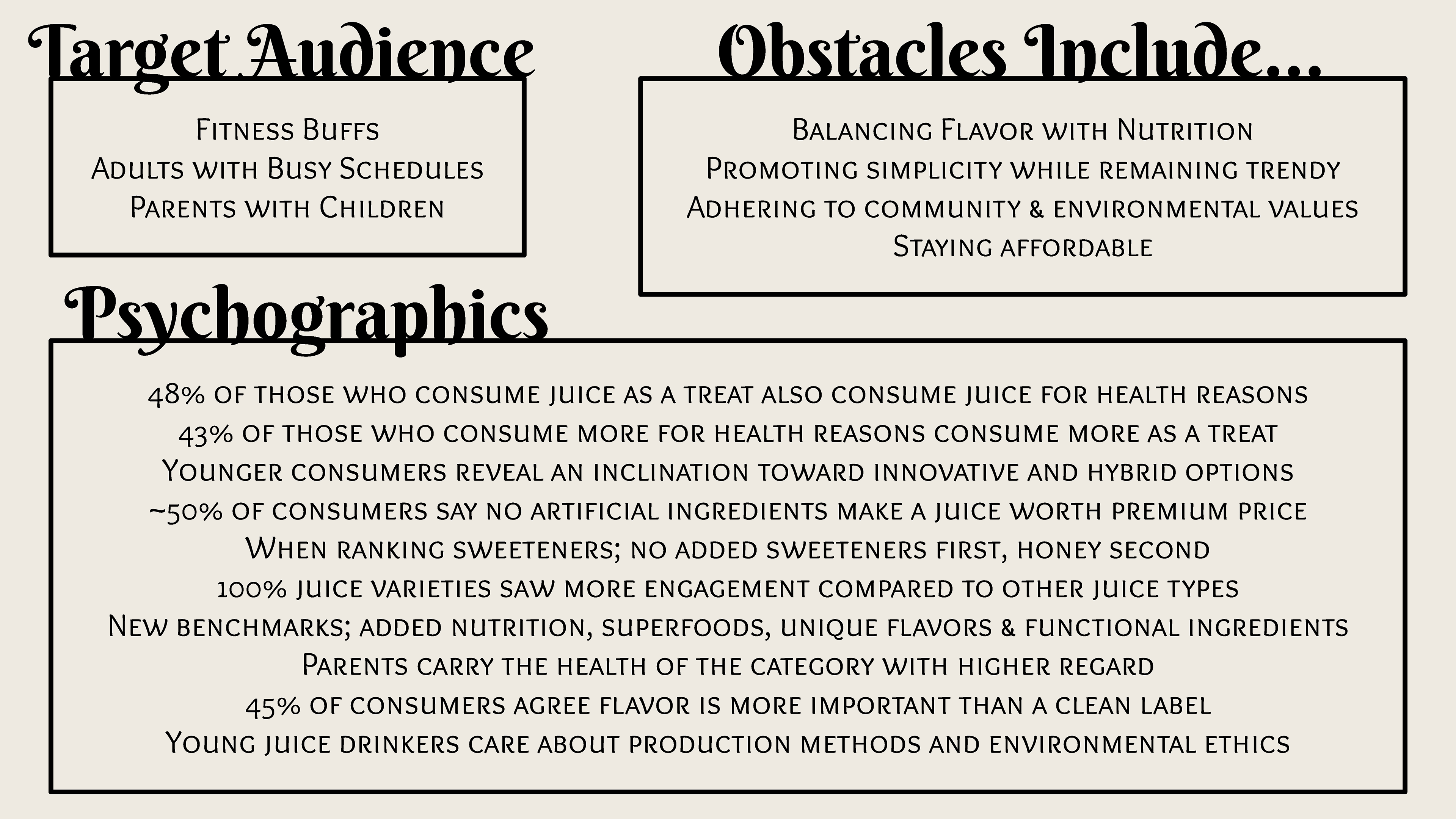
In order to figure out what niche the brand would fill, I searched the Mintel Database and found several in-depth reports. Each report spanned one year, and I read the reports for the past three. From this, I found that juice is often thought of as a breakfast accompaniment, but has also begun to be associated with health. I saw this healthy angle as an open niche and formulated the rest of the brand around it. From there, I identified audiences that would most likely find this approach appealing and worked to add even more positives for them.
COMPETITIVE ANALYSIS
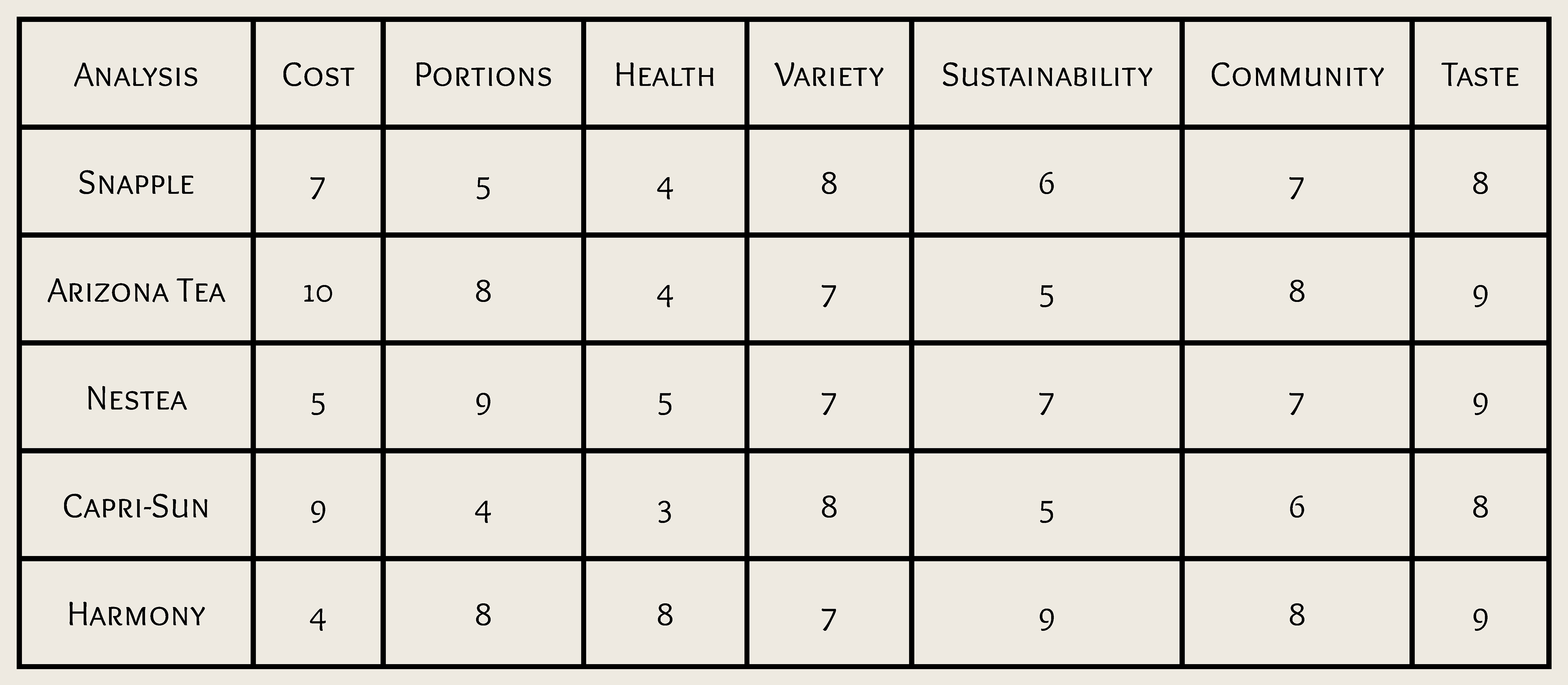
Once I completed my research and had a solid idea of what the brand would represent. I did some research into similar brands and compared all of them. Keeping my target audience in mind, I knew Harmony would want to have a strong commitment to community, sustainability, and health. Given how important it is currently for brands to adhere to the moral compass of the public, I wanted to make it clear that Harmony was there to serve the people, even if it might cause monetary losses. Due to this commitment, I figured Harmony would likely have to sell at higher prices.
DEVELOPING THE BRANDING
FILLING A NICHE
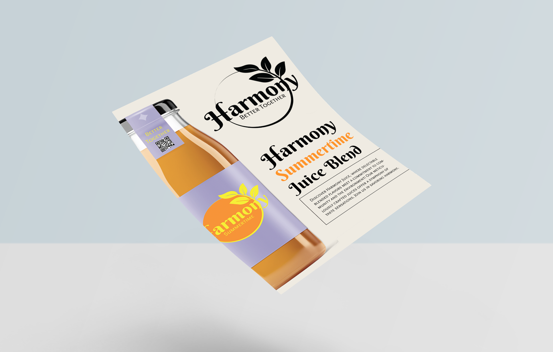
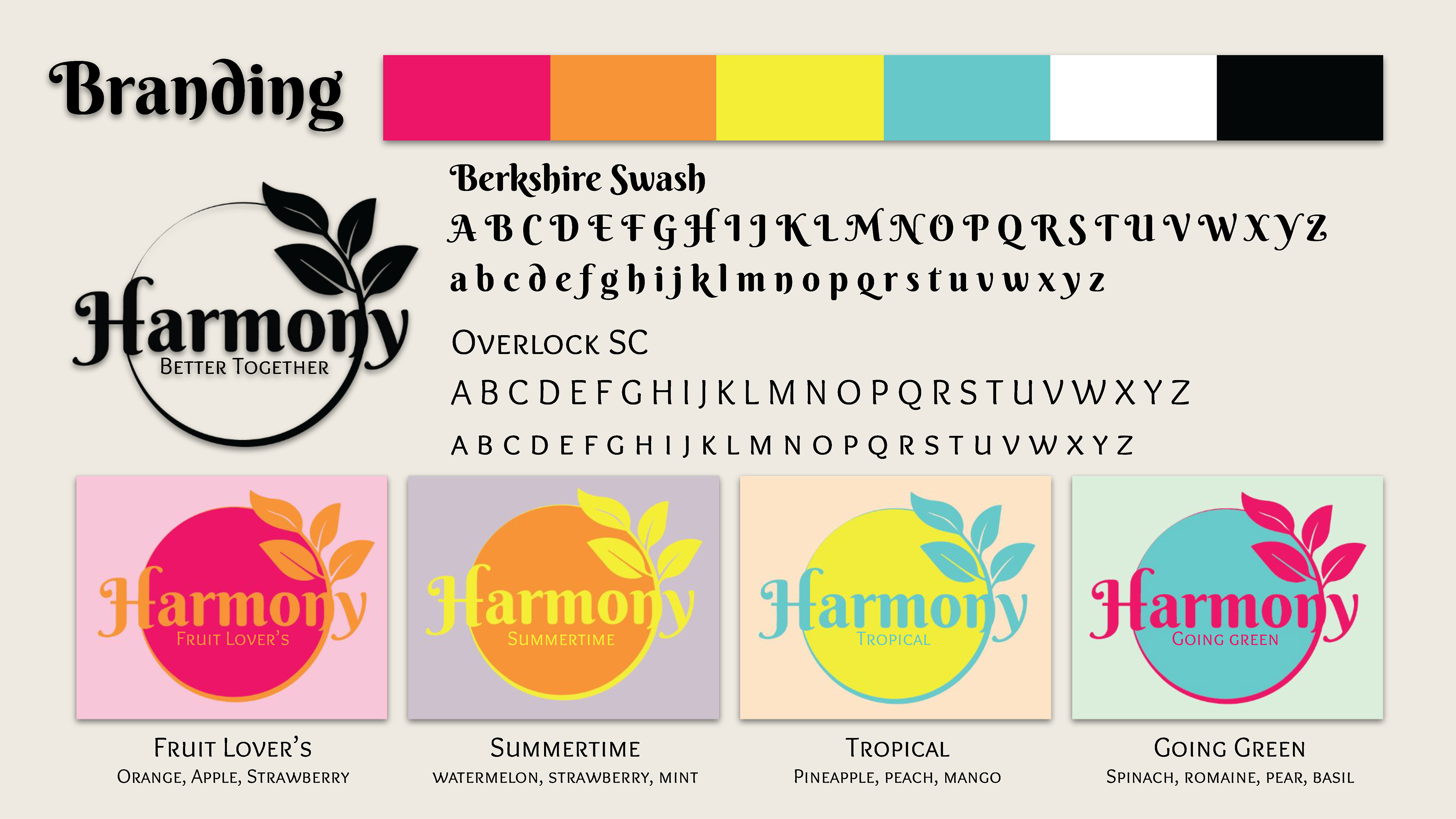
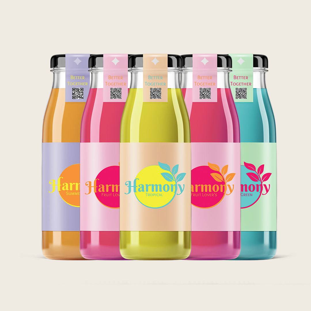
I wanted the brand to be associated with summer. Cold juice is infinitely more popular in the hot summer, so I wanted an engaging, bright, fun feel. I especially wanted it to appeal to kids and young adults, so I focused on bright but simple colors. It had to be easy to read and recognize, but colorful enough to catch your eye even when nestled amongst other juices and brands. I also wanted each of the flavors to have distinct but connected coloring. The different colors would indicate specific ingredient combinations, making it much easier for returning buyers to pick out their favorite.
PACKAGING DESIGN
SUSTAINABILITY
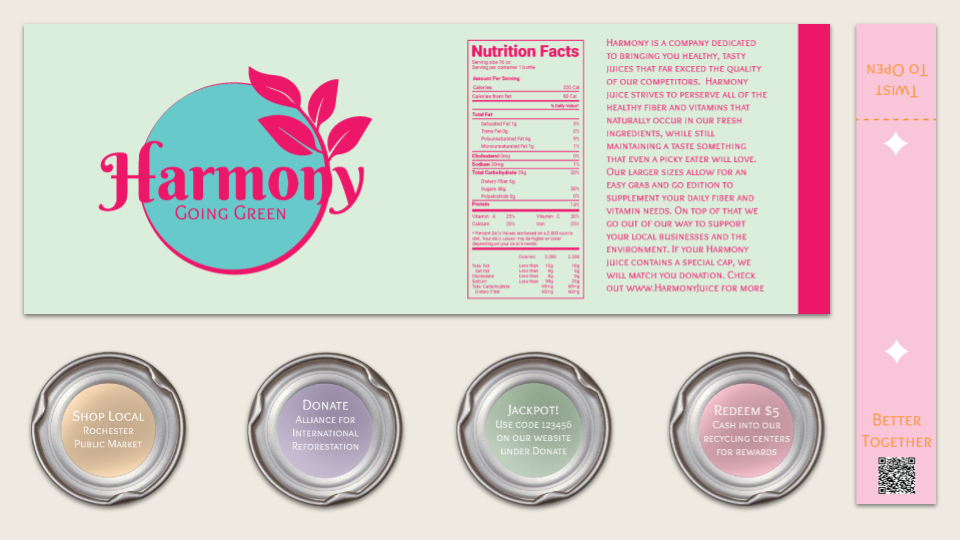
Given Harmony's focus on sustainability and the support of local businesses, I felt it was necessary to reflect that in the packaging. The bottles are glass with reusable metal caps. All packaging can be returned directly to Harmony through the retailer it was purchased from, or recycled normally. The caps can be returned or recycled, and have the added bonus of a little "Tips" under the caps. The "Tips" are related to local businesses or donations to environmental causes. The label and cap seal are made of biodegradable plastic.
MARKETING
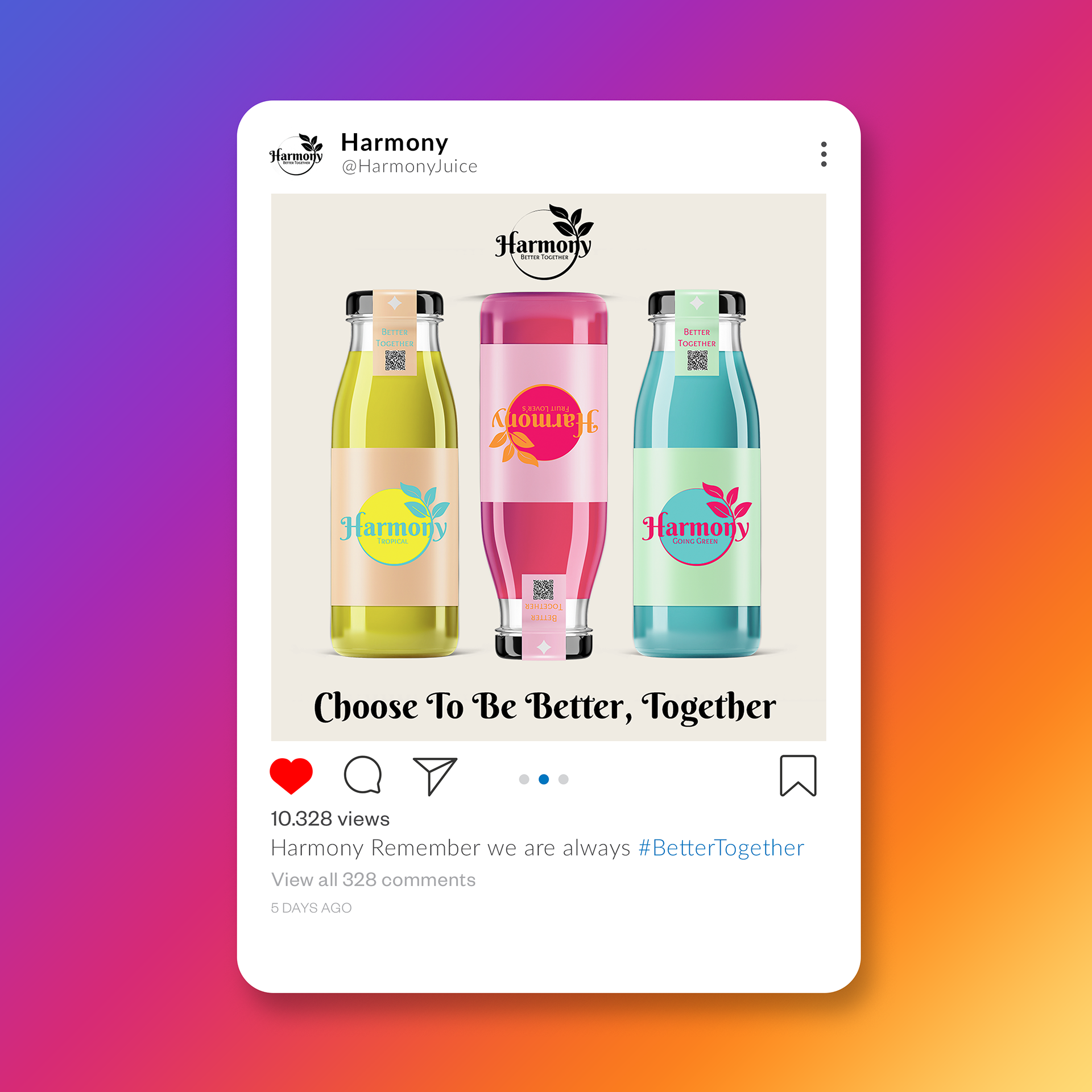
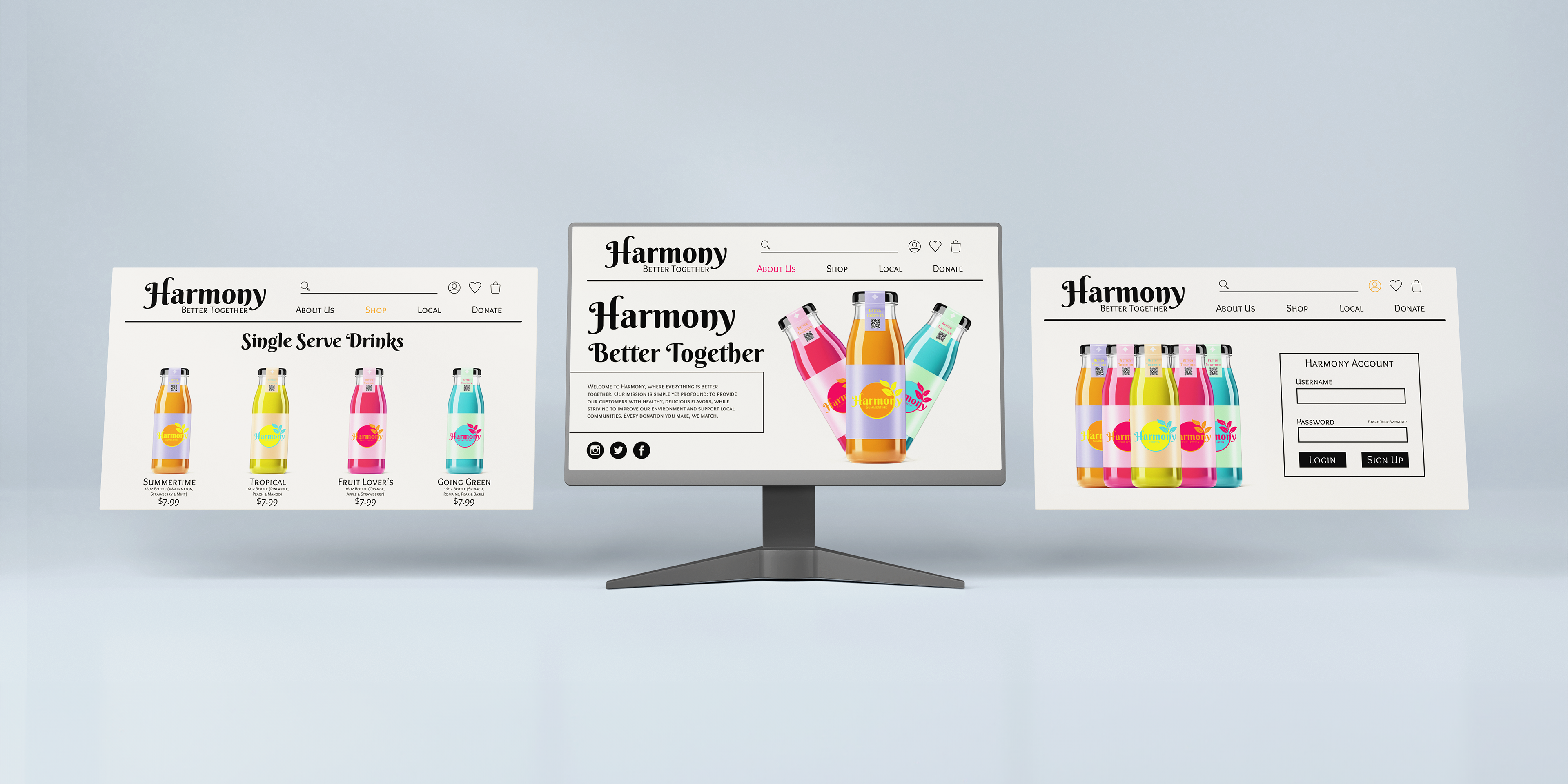
REACH
When considering Harmony's brand values and marketing tactics, it's expected that most consumers will be thirty or below. Using that information, I aimed mostly for a digital marketing campaign. Social media is imperative for cultivating a good reputation and the fastest way to send positive impressions to millions. Meanwhile, websites enable online purchasing and make it easy to attach memberships and subscriptions to improve customer retention.