FIRST STEPS
WHAT IS TYPOMANIA?
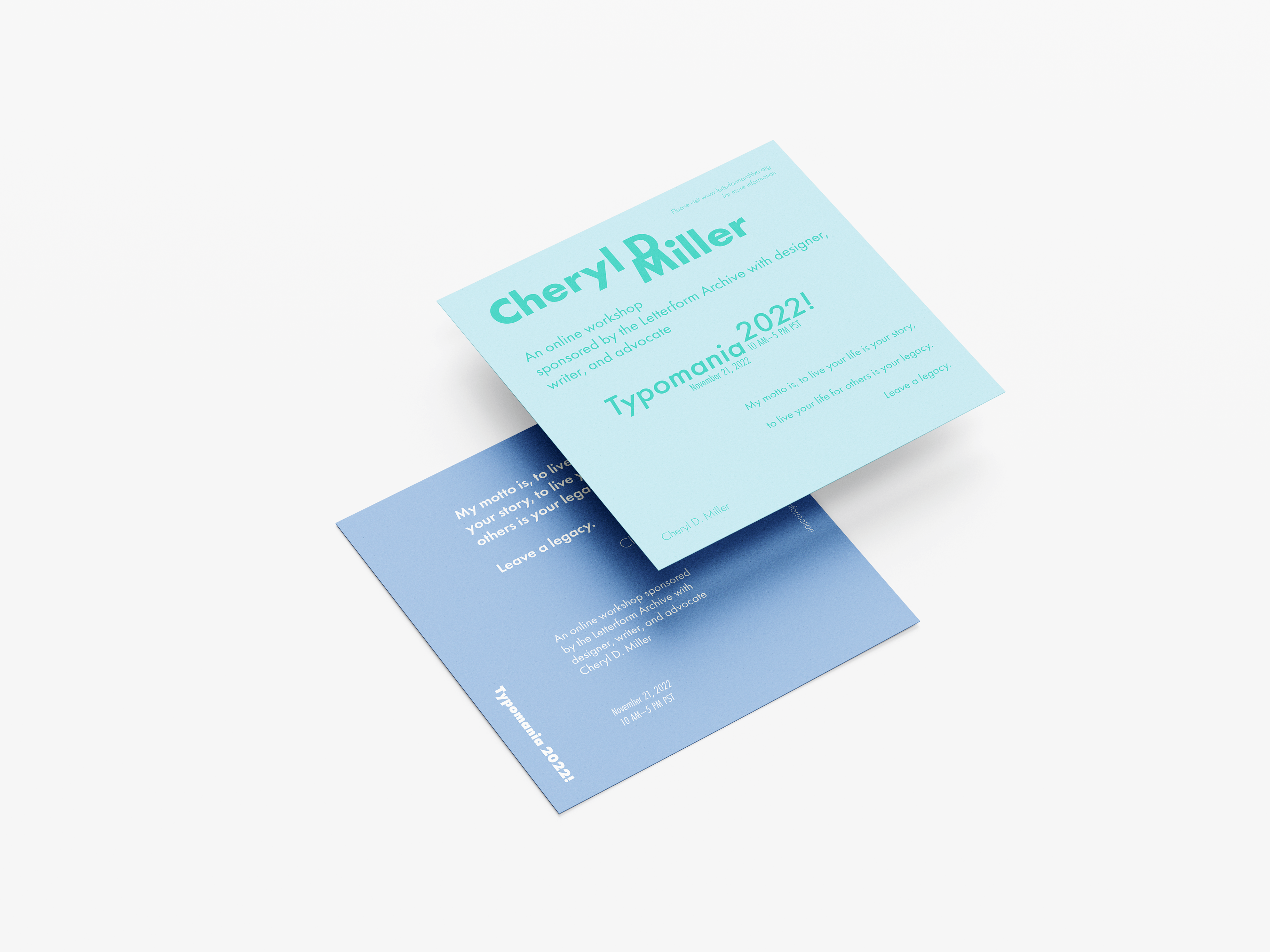
Typomania is an online workshop event sponsored by the Letterform Archive. Typomania aims to teach people of all ages the basics of type and the importance of typography in everyday life. Its goal is to spread knowledge and the love of Typography. This event is led by typographer Cheryl D. Miller.
PROJECT DESCRIPTION
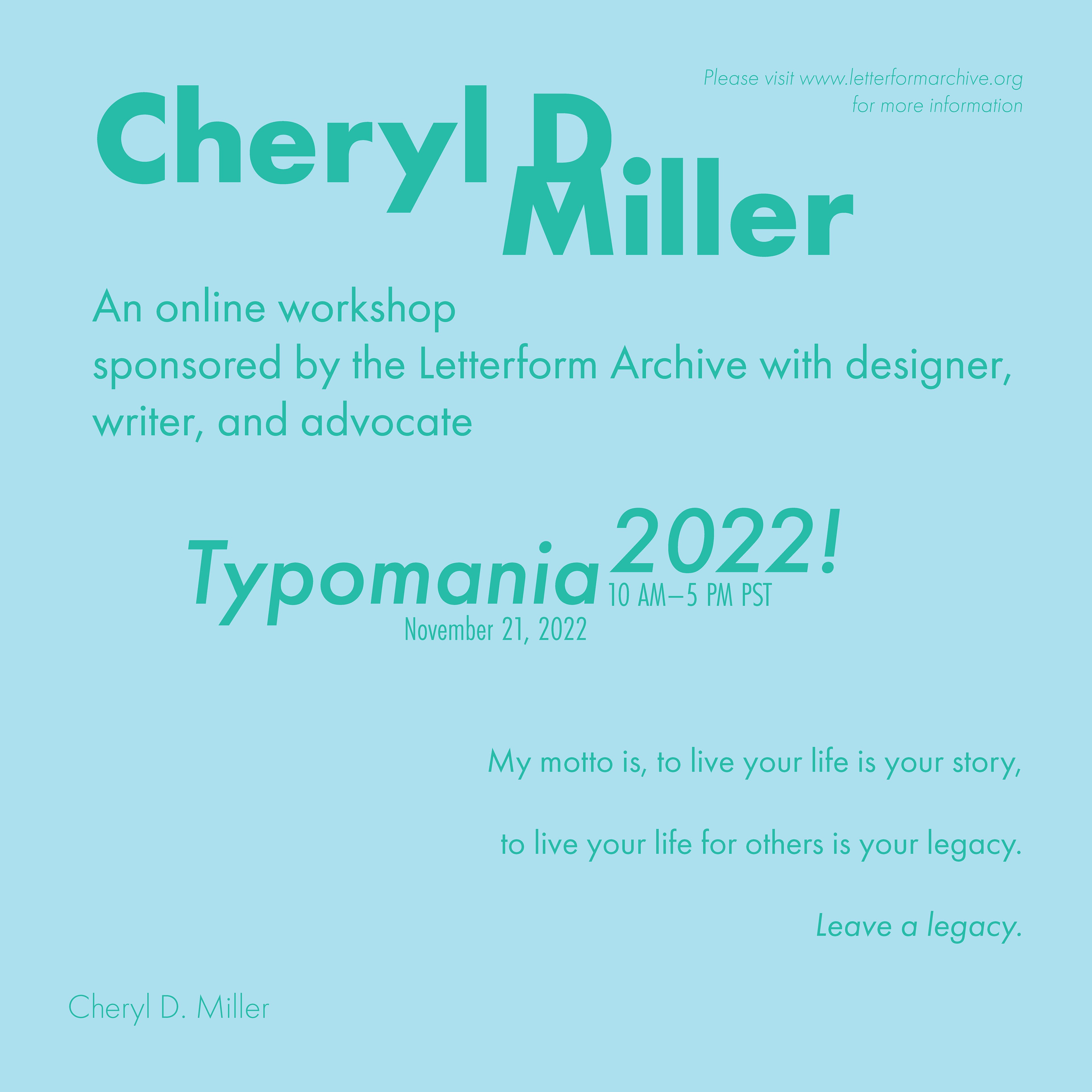
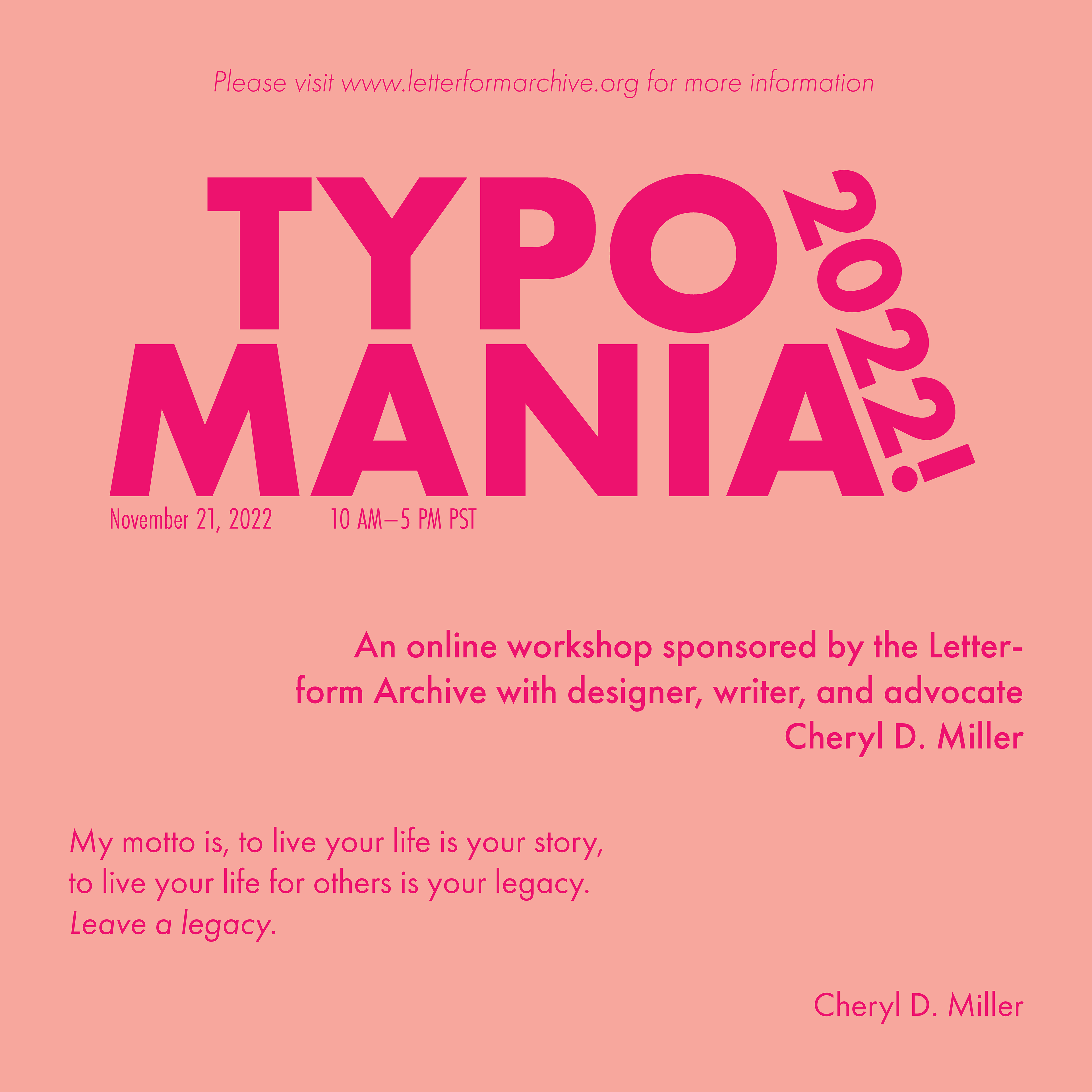
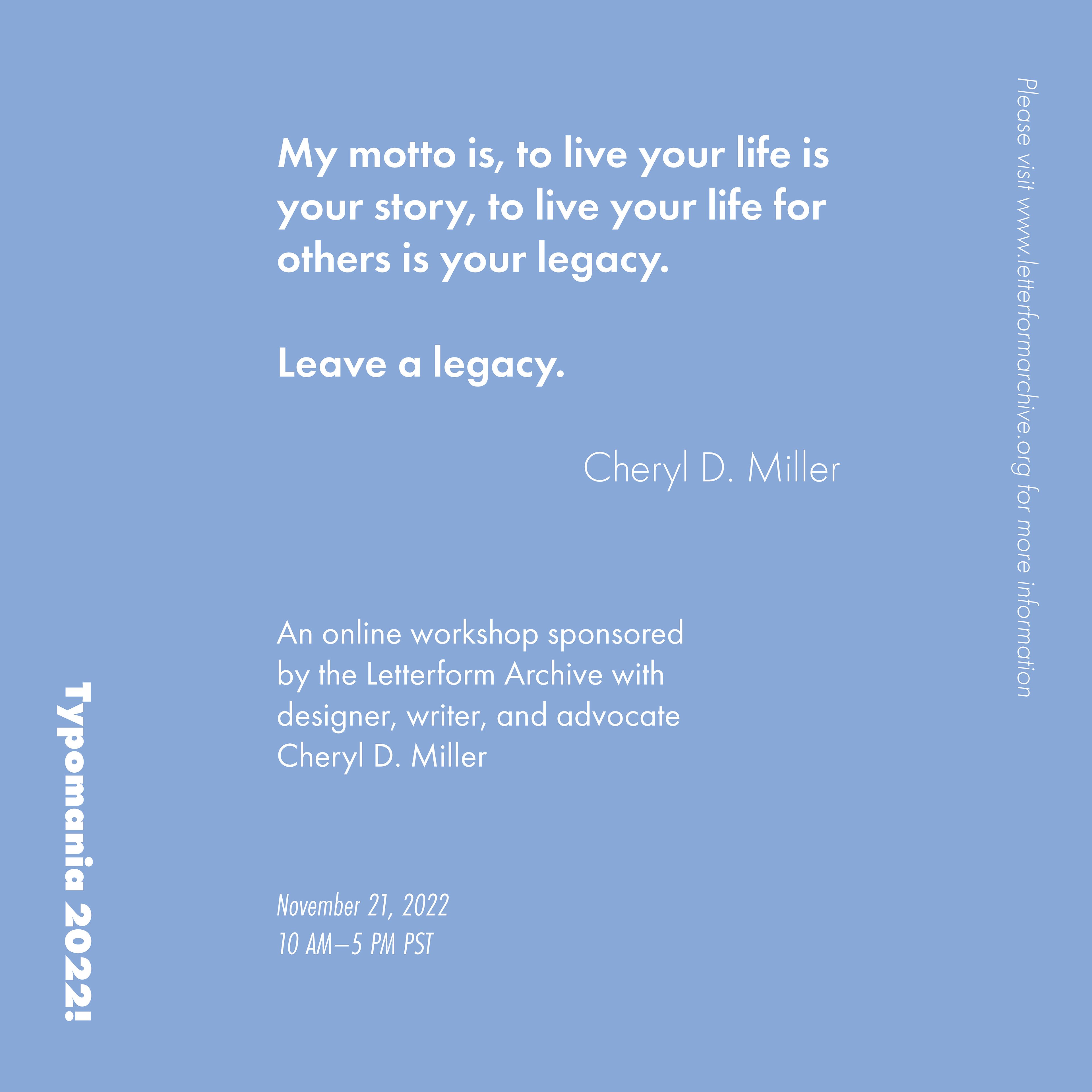
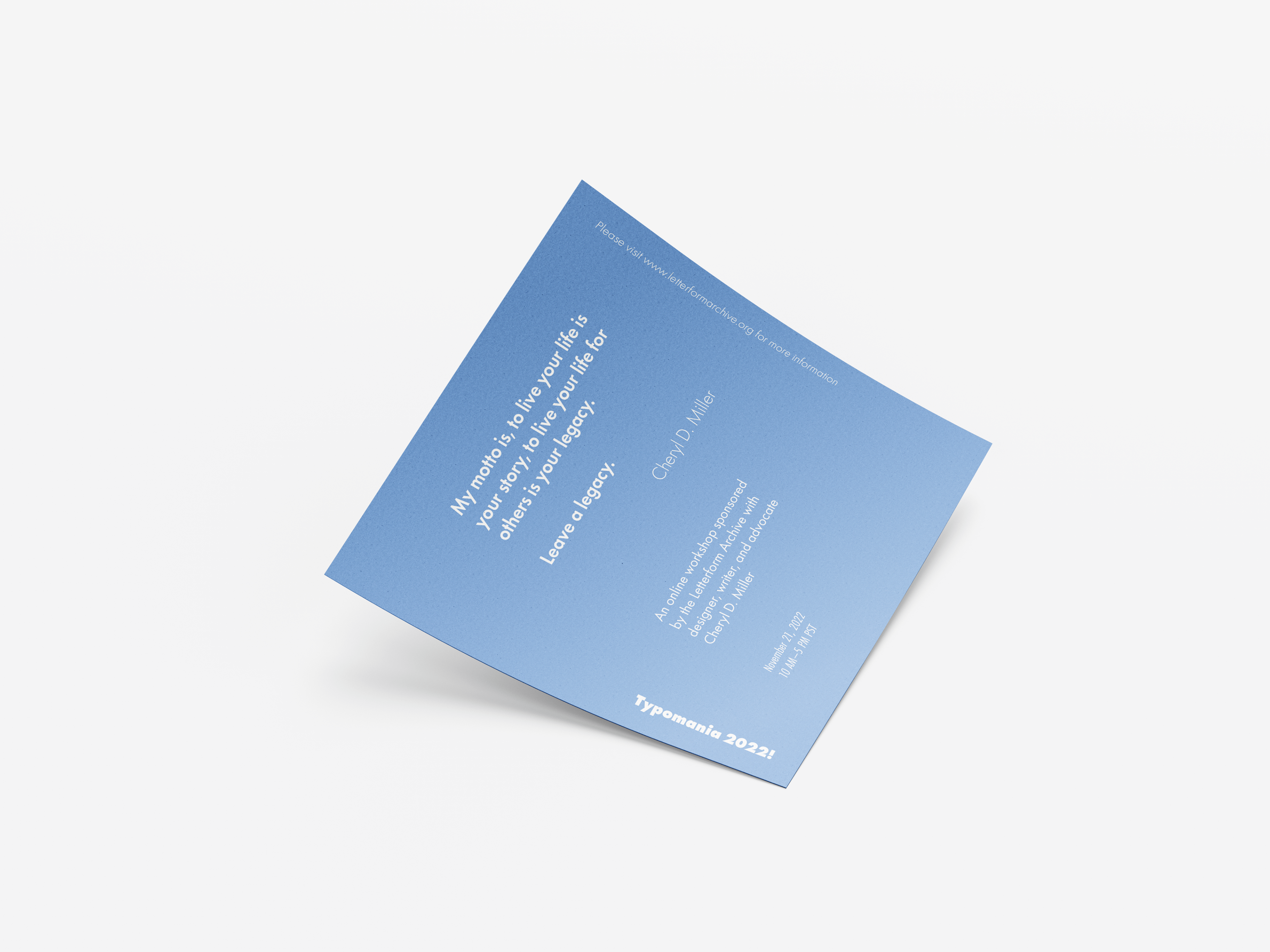
For this project, the client wanted us to create a group of three posters to advertise a guest speaker. Since the guest speaker is a typographer, we were told to only use type to create an engaging final product. Each poster needed to emphasize a different informative element. One poster for the event, one poster for the speaker, and one for the quote.
PROCESS
BRAINSTORMING
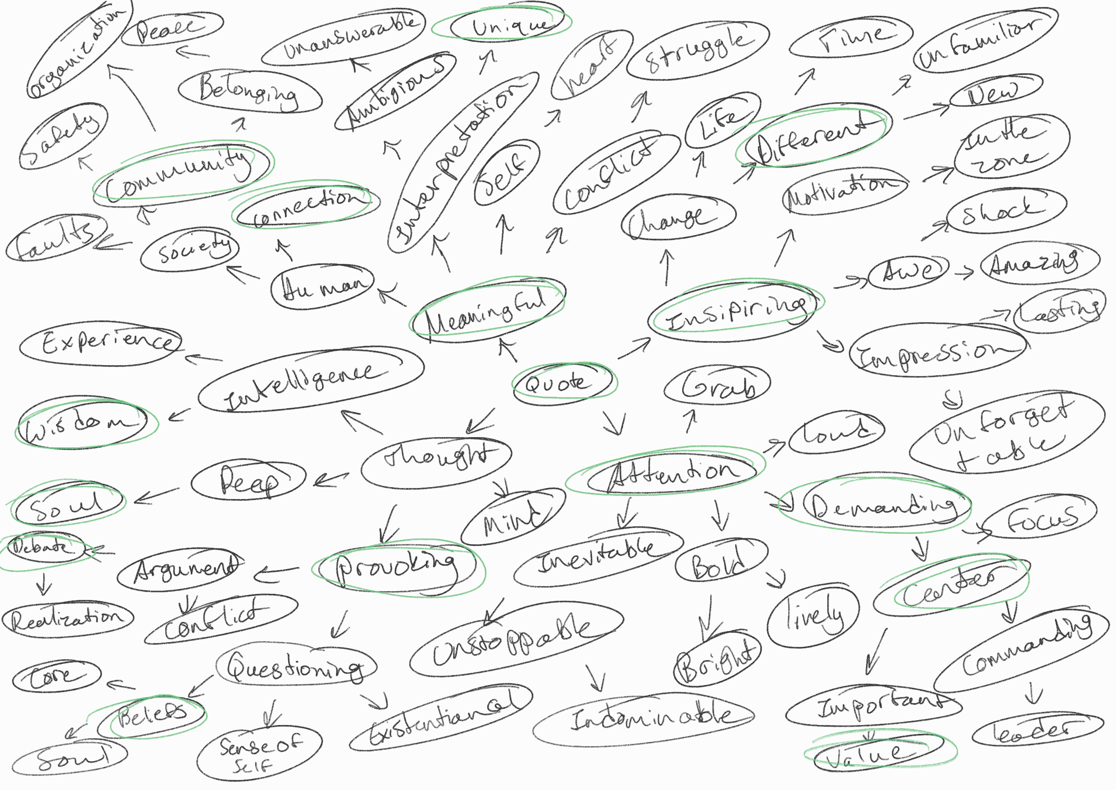
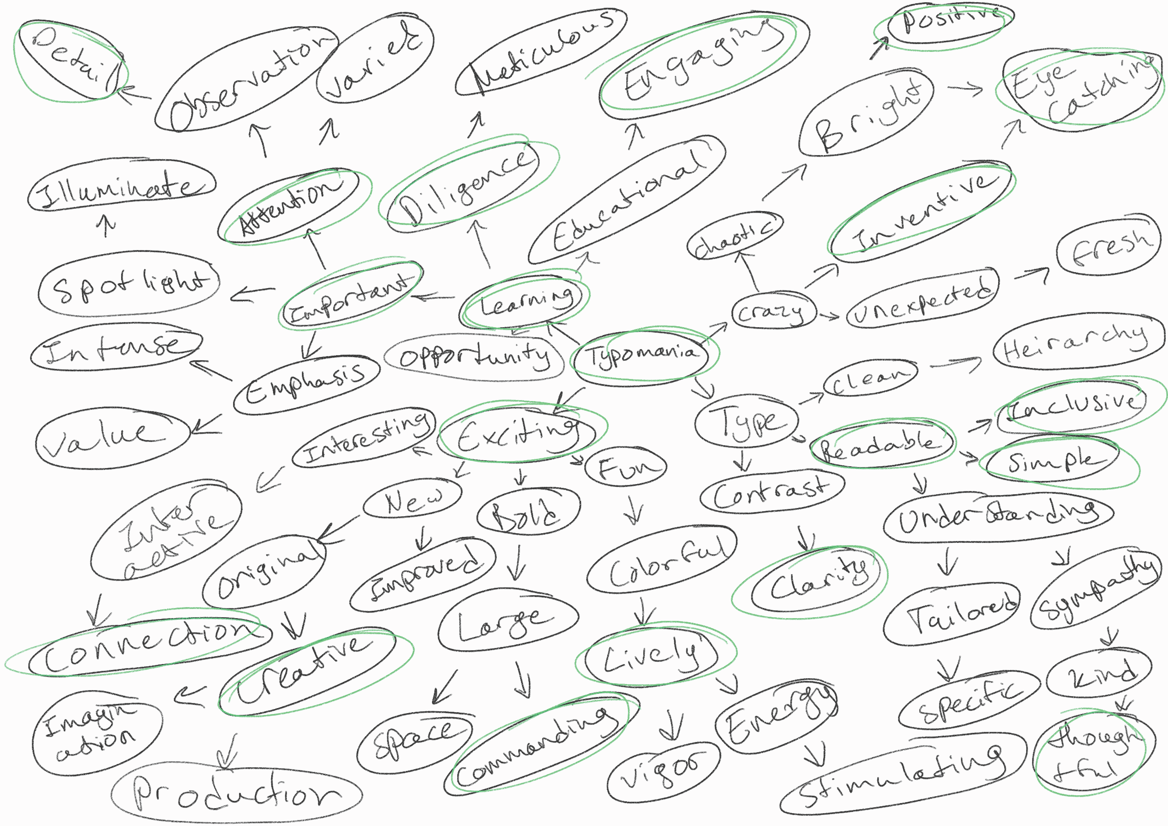
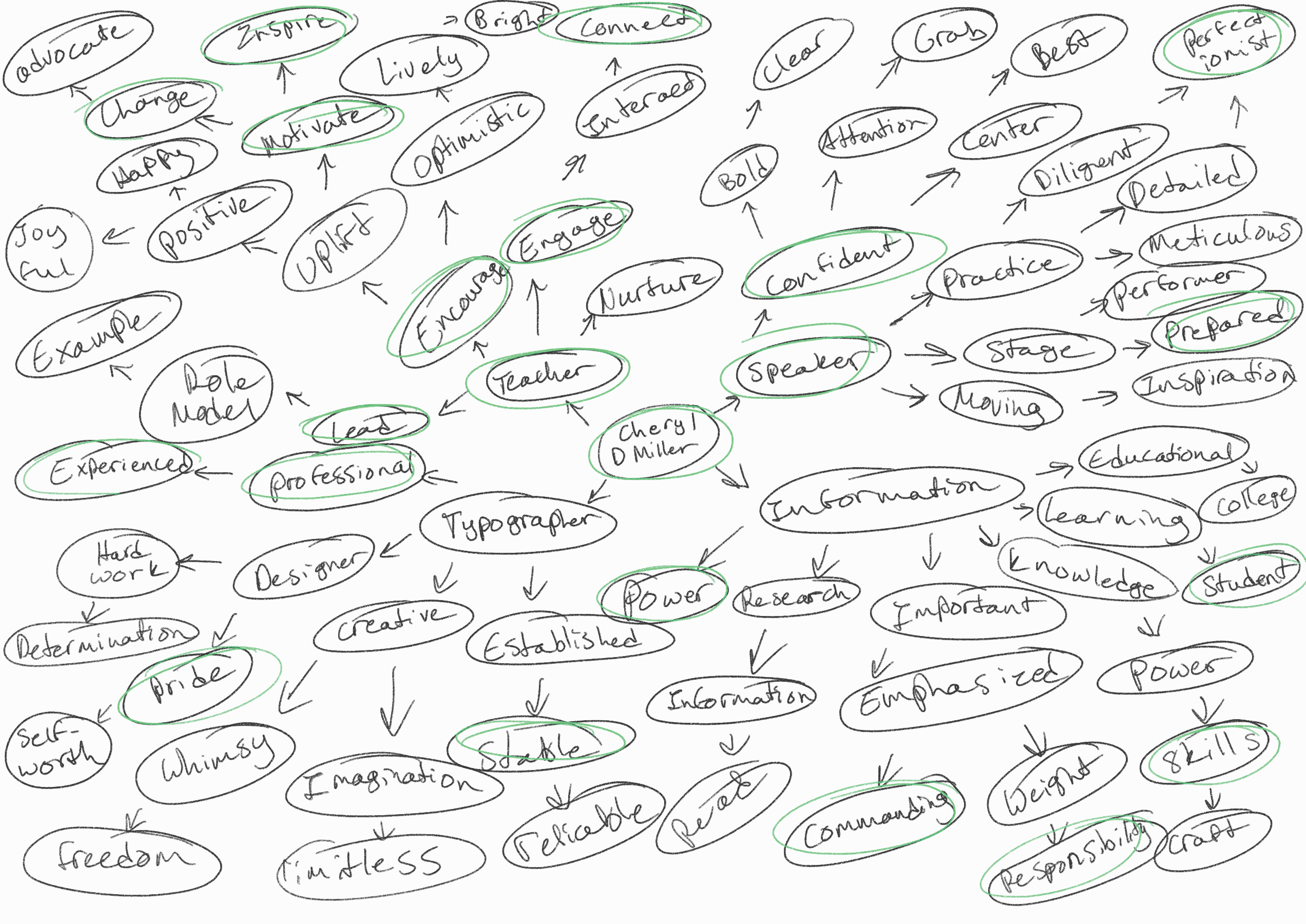
My process began with brainstorming sessions. I used a mind map to help sort out my ideas. I placed the focus of each poster at the center of the map and worked outwards from there. After I finished, I circled concepts that resonated with me and made those concepts the center of each poster's design.
VISUAL RESEARCH
I spent a fair bit of time analyzing other type-only posters to see how other designers utilized the space without the aid of any other visuals. The recurring pattern I noticed was the use of type in place of the normal illustrative visuals you would often find on posters. I also saw frequent use of brighter colors on darker, more subdued backgrounds to heighten contrast.
DRAFTING
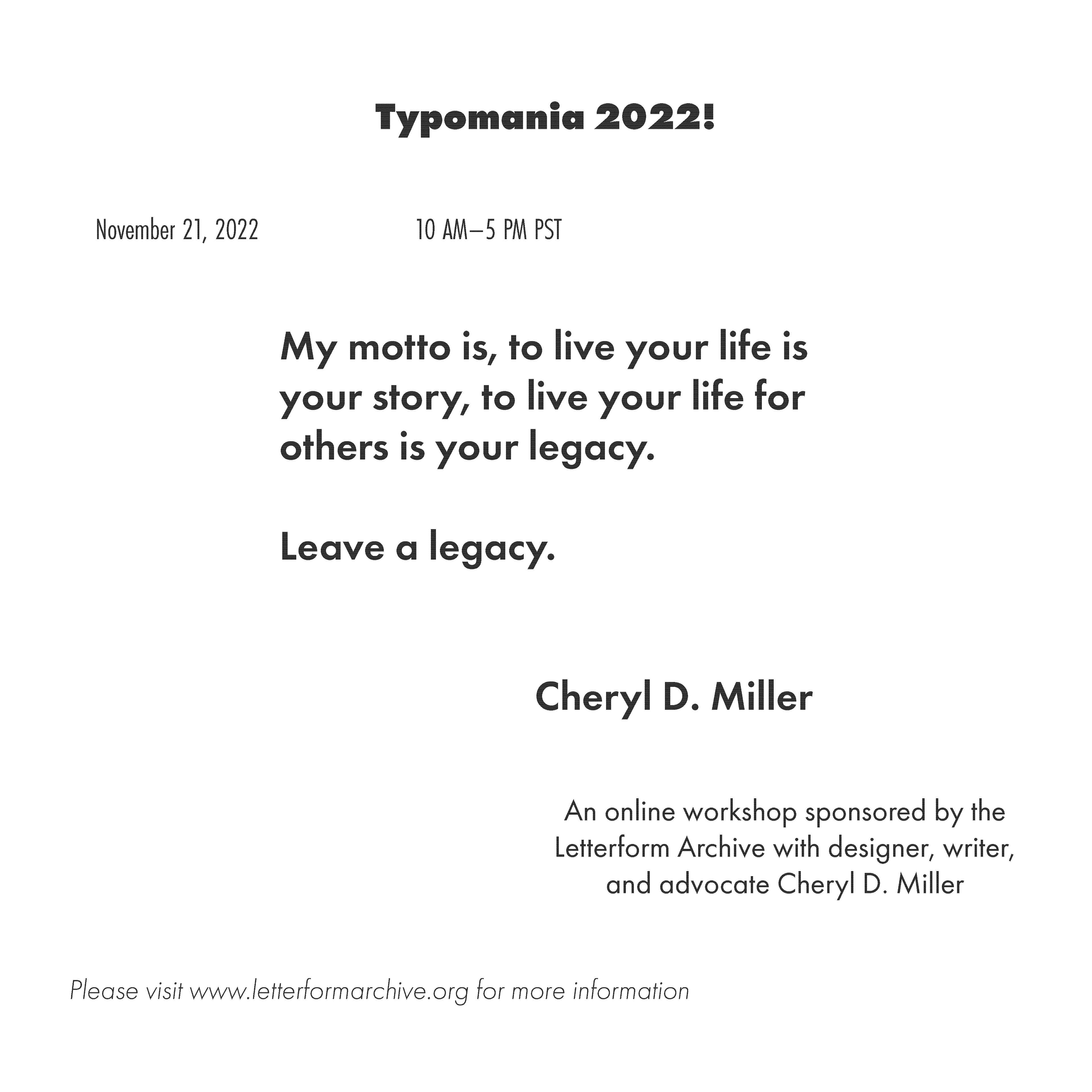
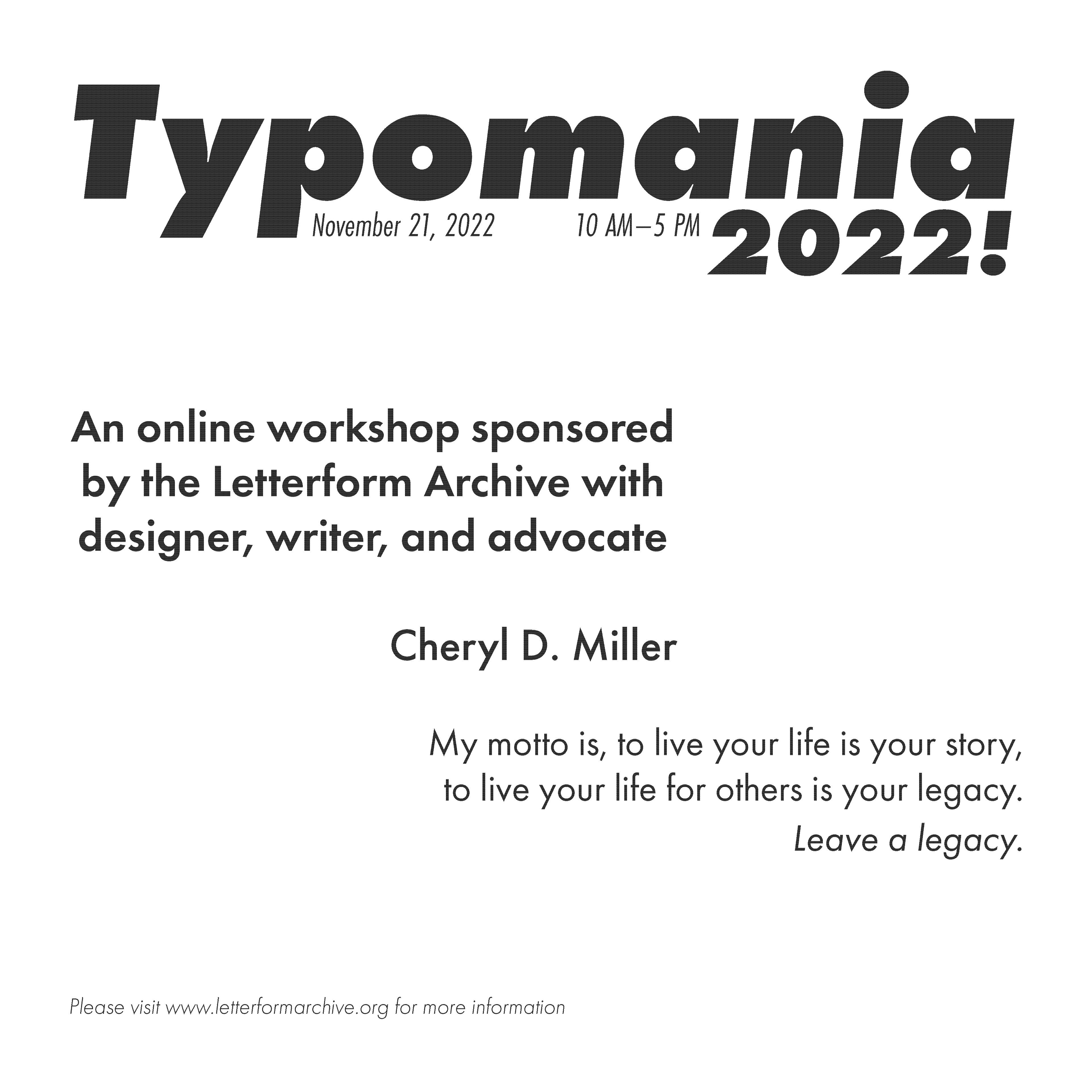
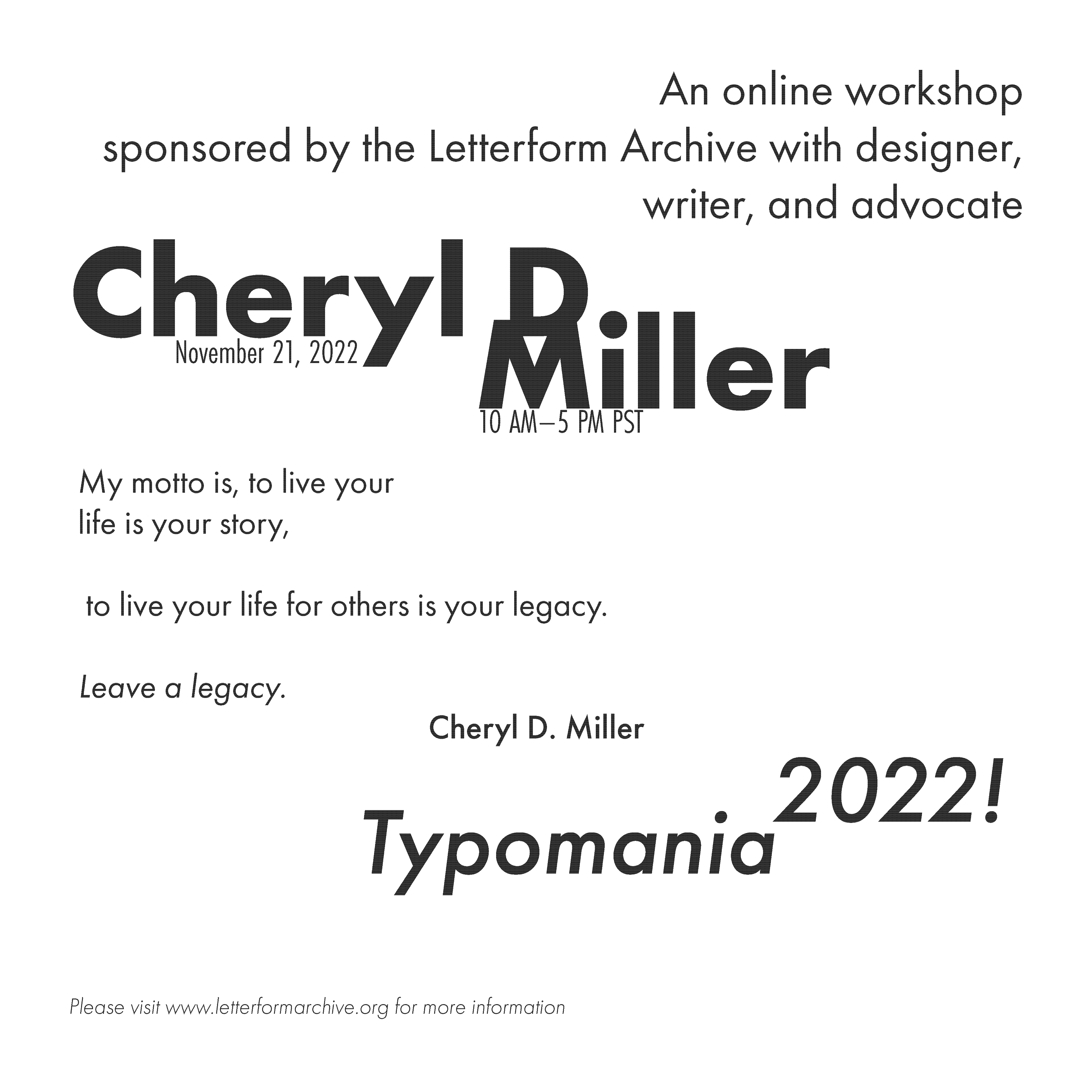
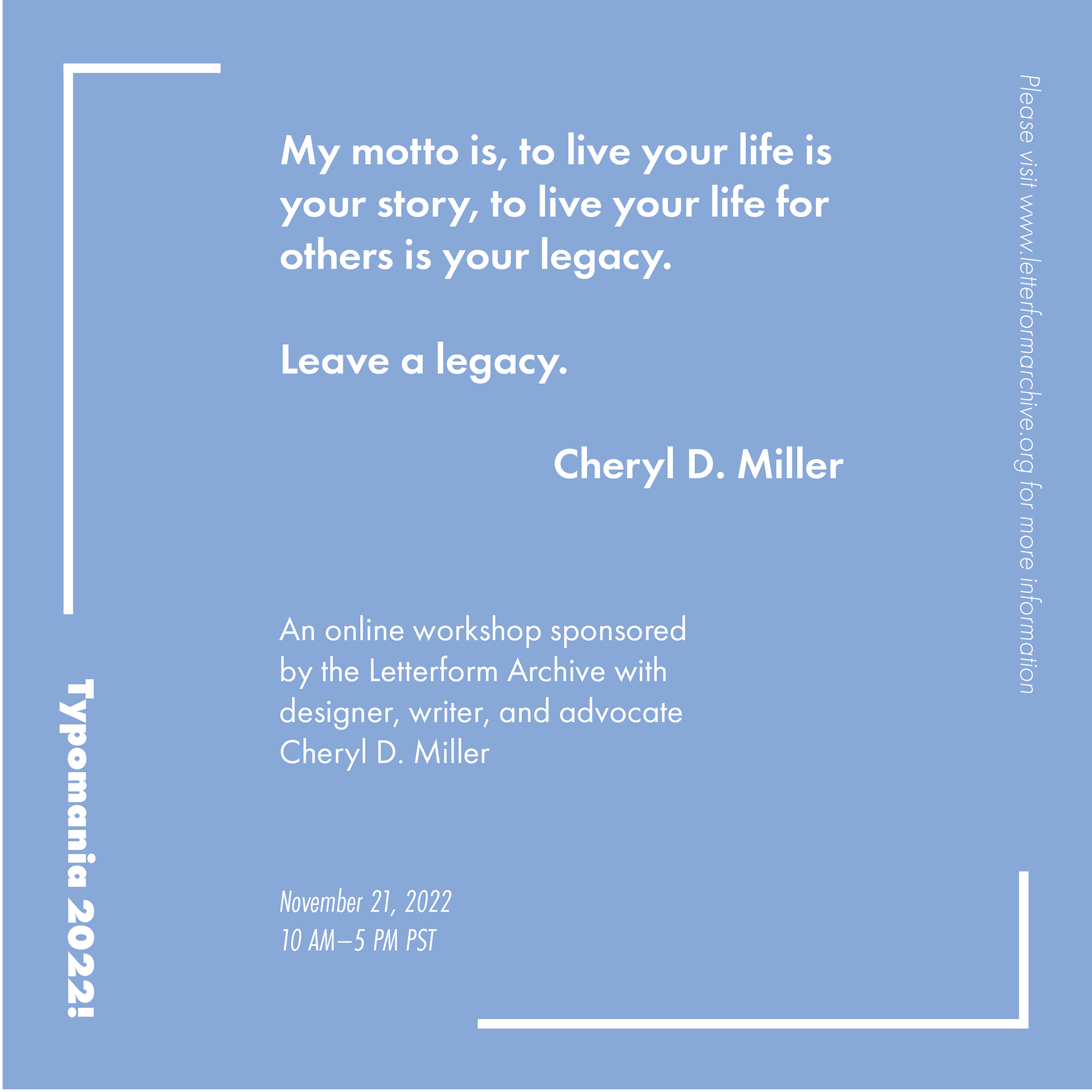
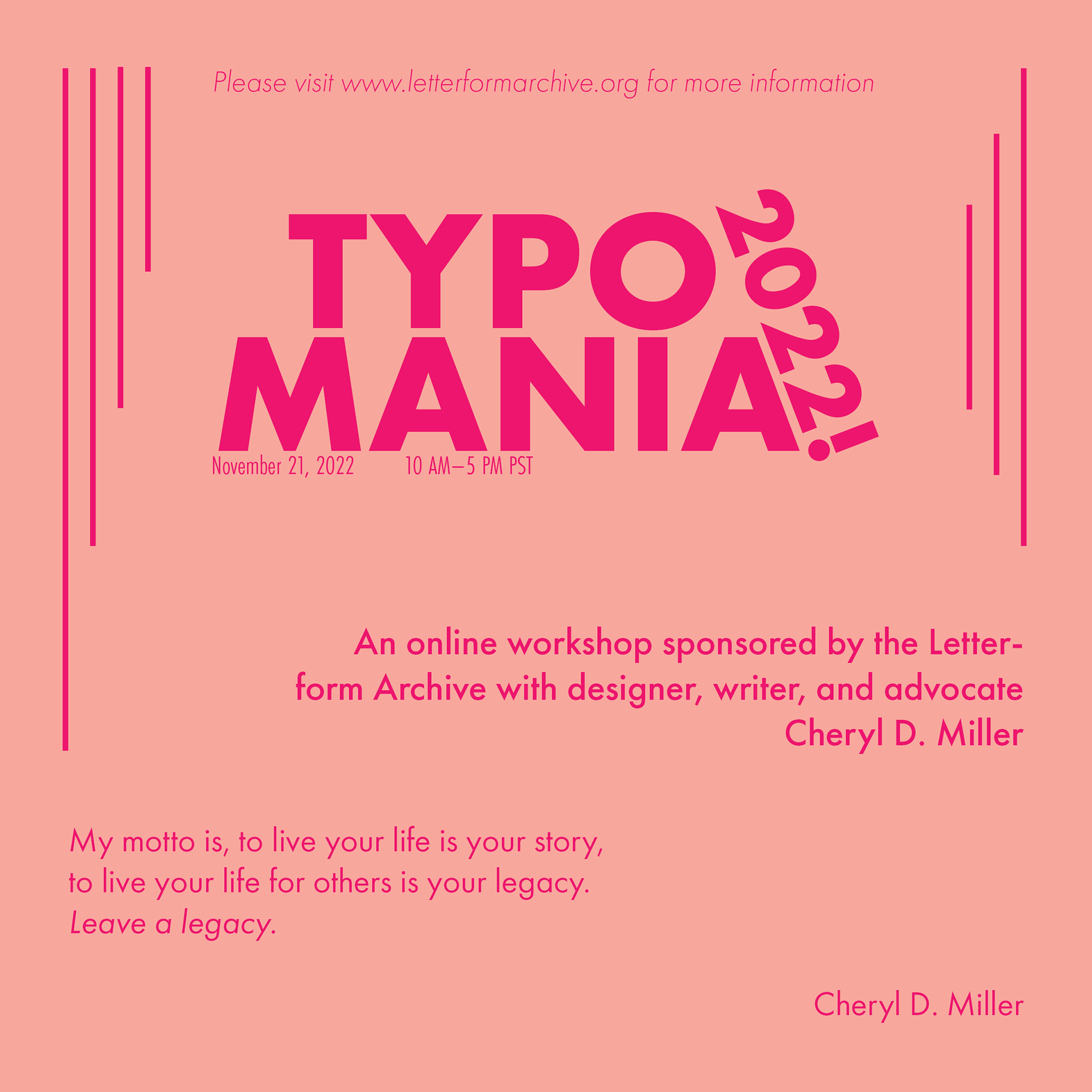
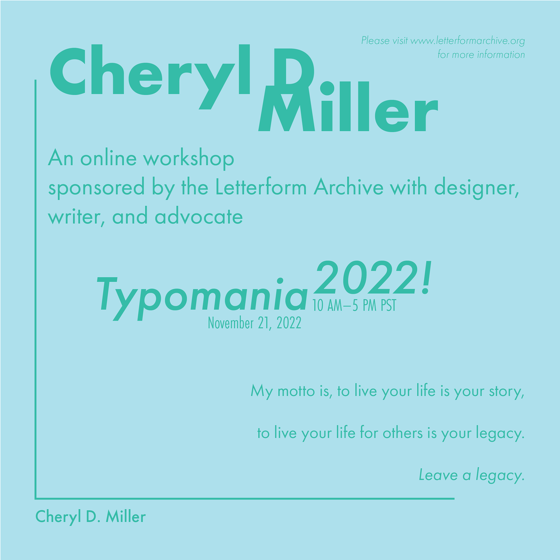
A lot of my drafts were focused primarily on how to fit each element into the poster, while still effectively filling space and allowing the hierarchy to create a dynamic piece. I wanted to engage the viewer and lead their eyes around the page with the given information. When I first began, I worked only in black and white. I wanted to avoid using color as a crutch. After several rounds of ideation, I took a few favored layouts and played around with different typefaces and colors. I chose Futura because it was a sans serif with multiple variables. The sans serif allowed for easy scaling and improved legibility, while the typeface variables made it easier to create a well-defined hierarchy.
FINAL PRODUCT
