FIRST STEPS
PROJECT BRIEF
Pick a social, political, or environmental issue and design an iPhone app that addresses and helps solve that issue. Make sure to focus on readability and overall aesthetic. Your target audience is college students. Any research and information must be factual and credible. Make sure to add gamification to the final product.
MY GOAL
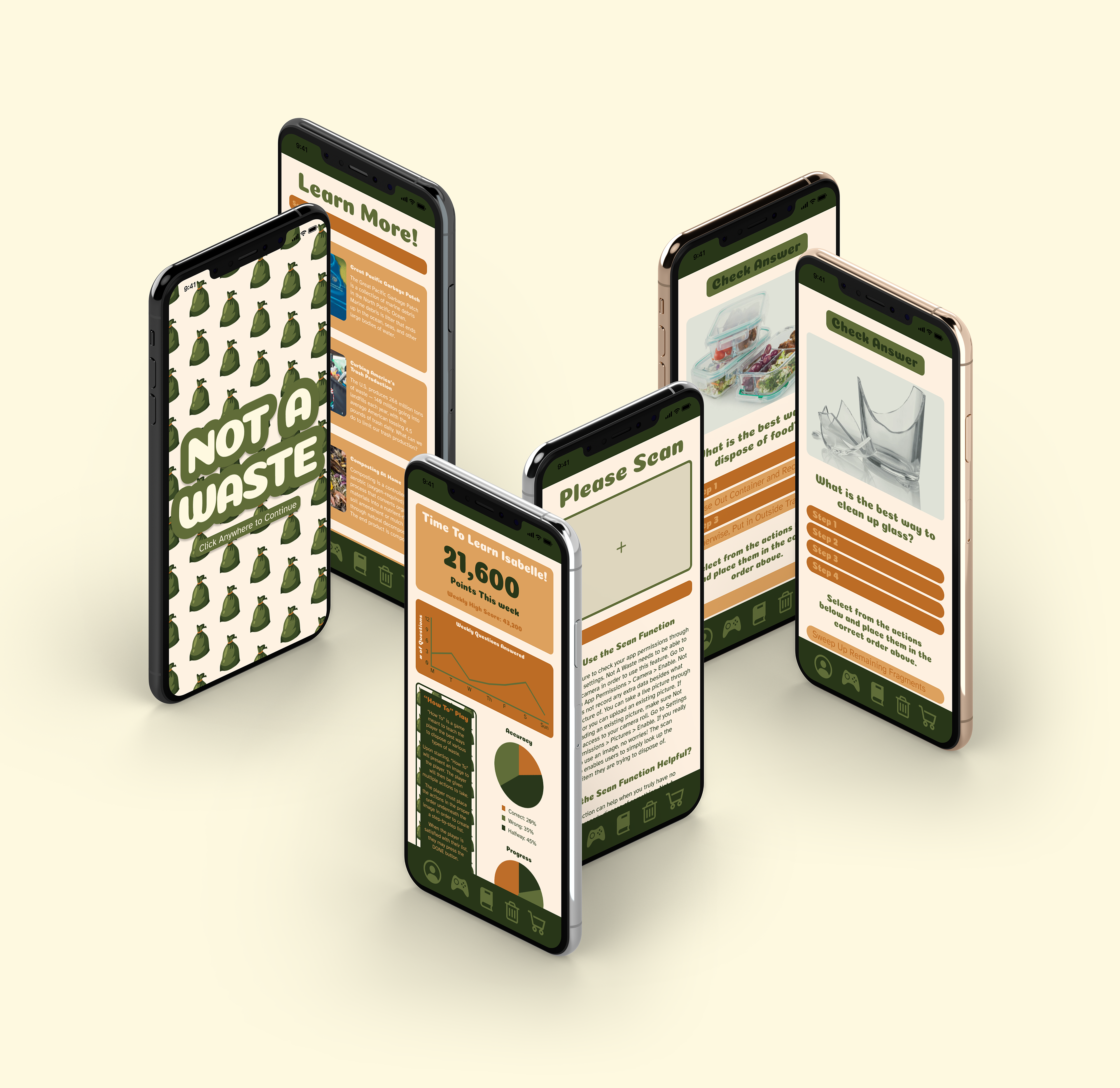
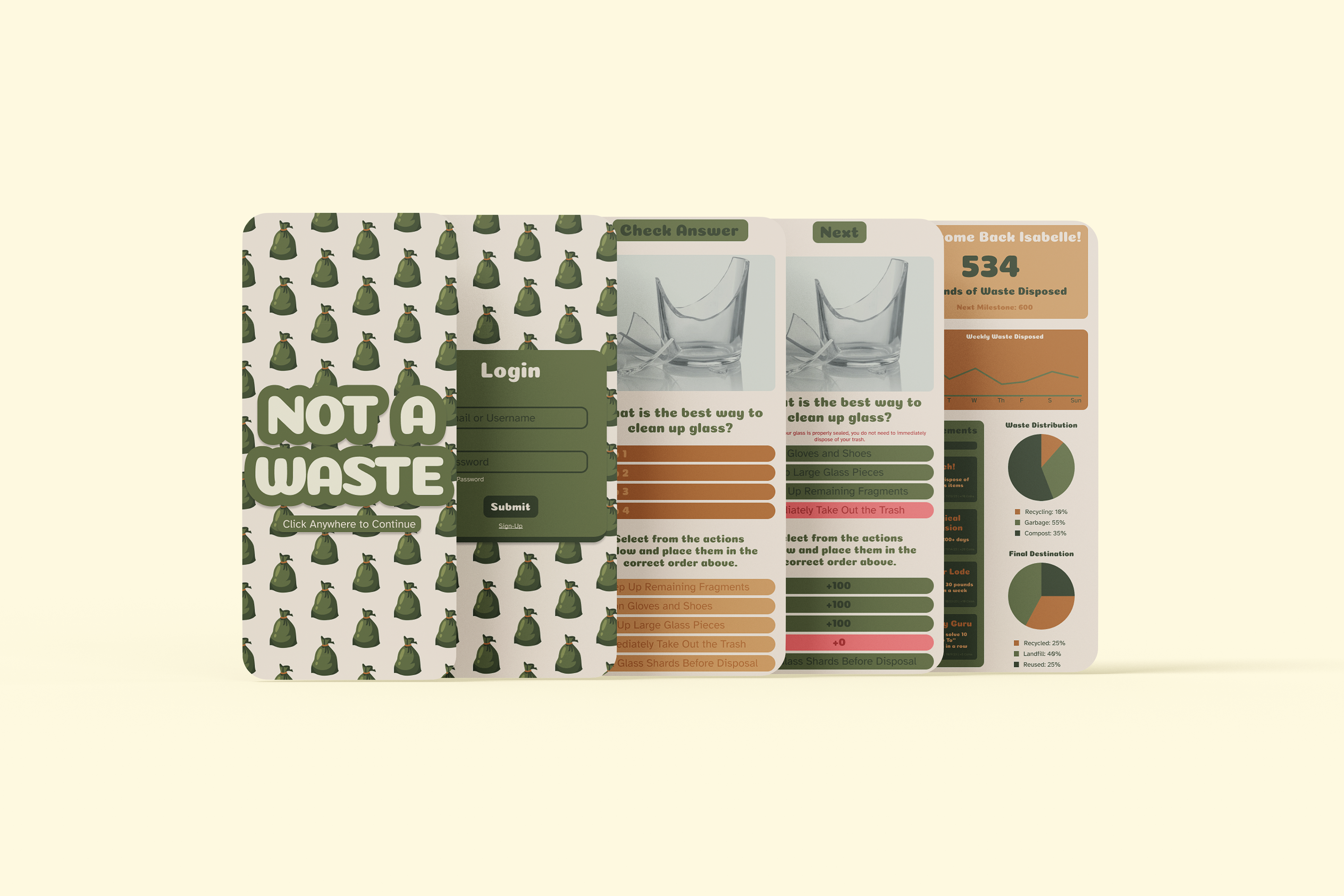
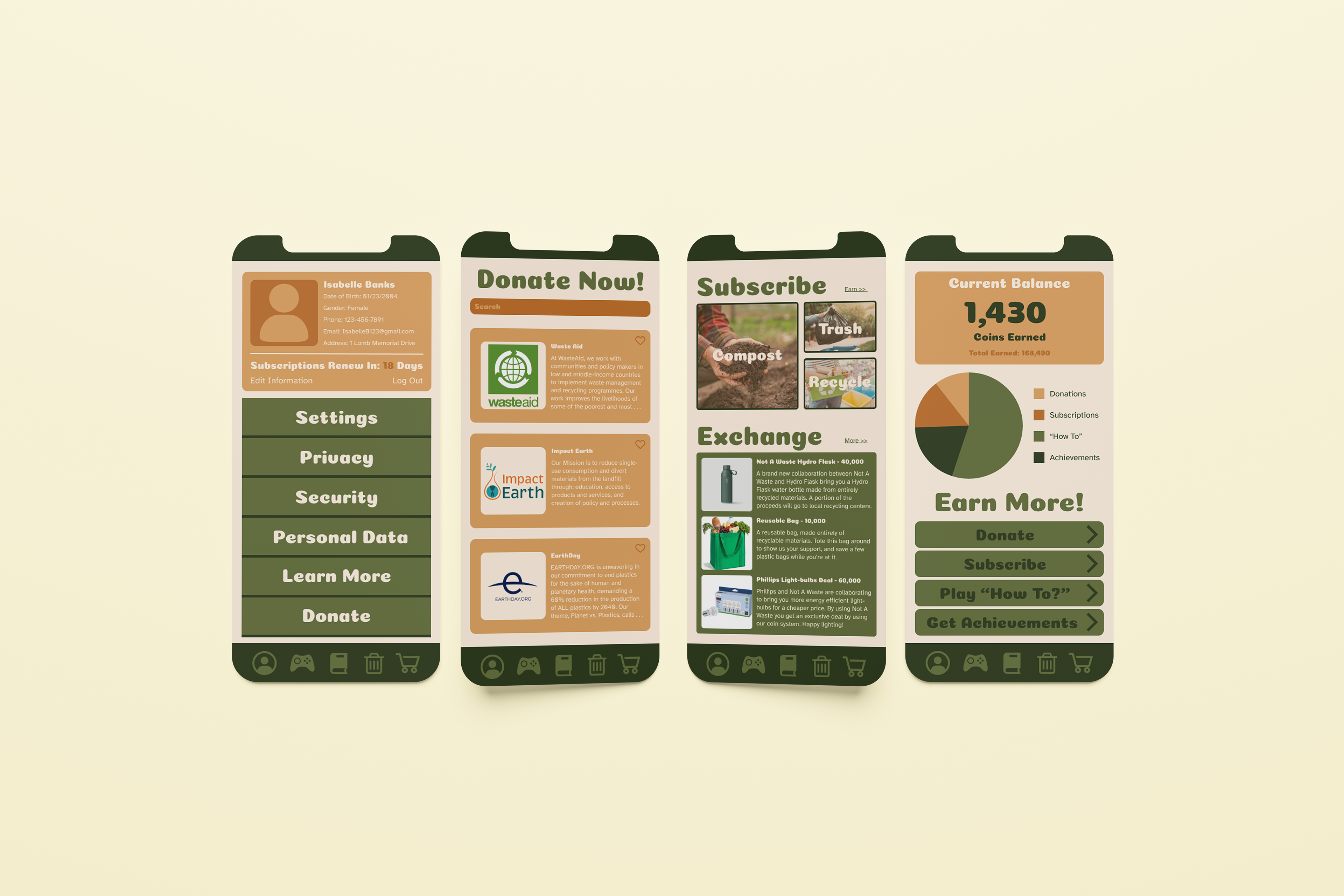
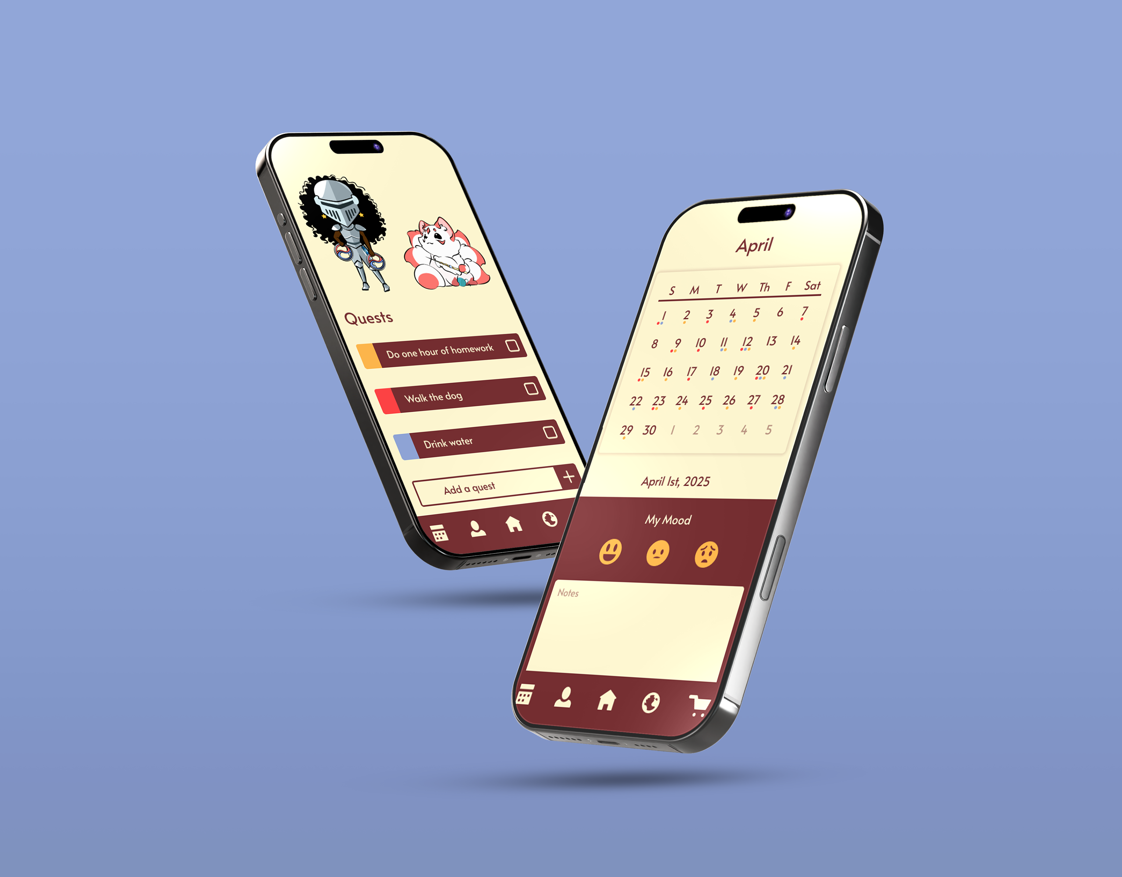
In high school, one of my teachers made the class watch a documentary about how much food humans waste by improperly disposing of it, and it stuck with me ever since. Now, as an RA, I see firsthand how poorly college students handle their waste. Knowing this, I wanted to create an app to help people properly dispose of the waste they produce. My first goal was to make it appeal to college students. I felt that simple, but engaging educational methods were the way to go. I wanted them to be able to search for credible answers to things they might not know, as they were already well accustomed to Google. I decided to use gamification to educate and help people get into the habit of self-regulating.
IDEATION
RESEARCH
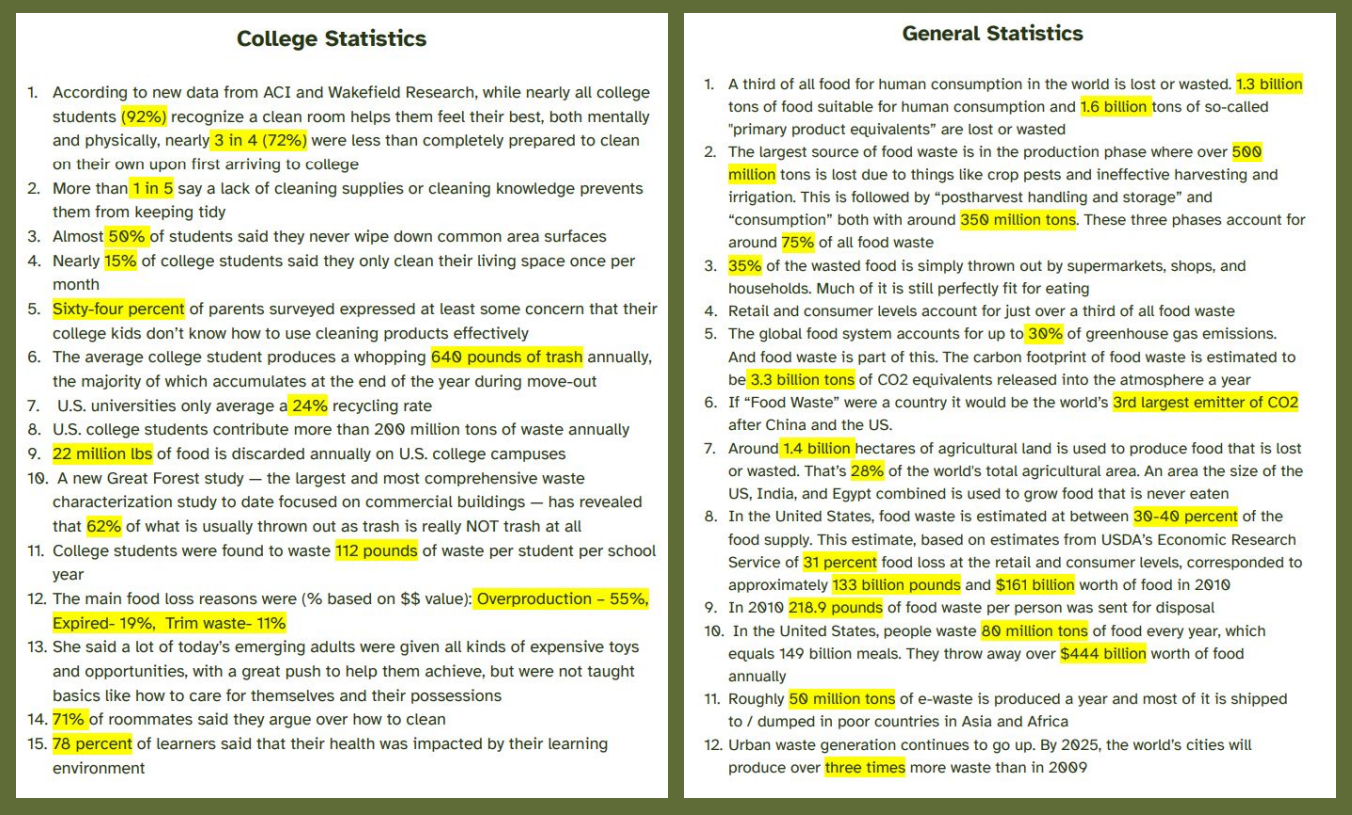
Using the school database and library, I read papers and books addressing our global waste crisis. I used the National Waste & Recycling Association (NWRA) to consult for credible advice on waste management and disposal.
COLOR & TYPE
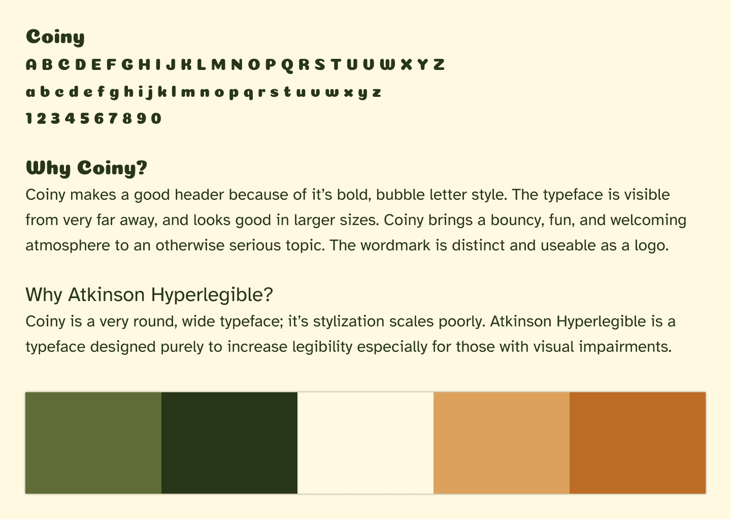
After analyzing other waste management apps, I realized most had poor retention due to their rigid and overly formal designs. I needed to make learning and waste management fun to promote consistency. After a quick type study, I settled on Coiny and paired it with Atkinson Hyperlegible. Coiny brought a fun feeling and meshed well with the soft, rounded design elements I had already envisioned. Atkinson Hyperlegible ensured that even large paragraphs of information remained legible and that important content was easily accessible, even to those with visual impairments. When choosing colors, I wanted something bolder than the standard green, white, and blue. To utilize bolder browns, I darkened my greens and added a light neutral color to balance the stronger colors and provide higher contrast.
COMPETITIVE ANALYSIS
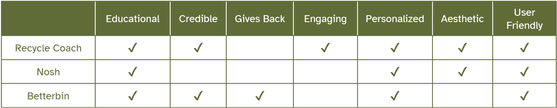
I analyzed preexisting apps with functions similar to my end goal to understand what tactics were effective and what weren't. I found that most waste management apps had poor engagement and were very text-heavy. They didn't offer much in terms of self-management and provided no incentives to make lasting changes by connecting with the community and other organizations.
DEVELOPMENT


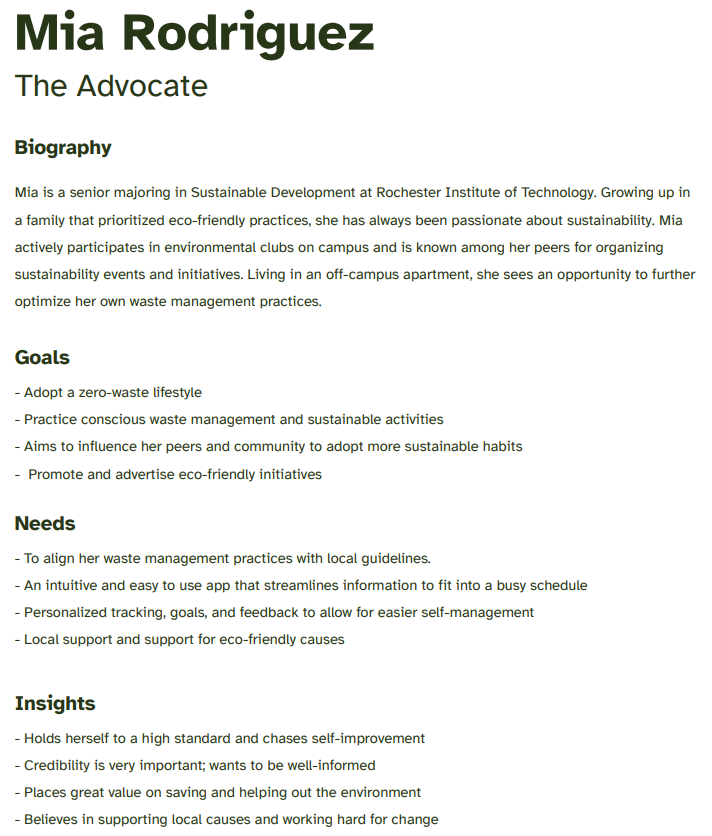
USER PERSONAS
Using the Mintel Database, I investigated statistics surrounding apps and programs similar to my goals. With that knowledge, I created two user personas to represent a wider whole. Creating these personas allowed me to fully examine the possible breadth of users and tailor my designs accordingly.
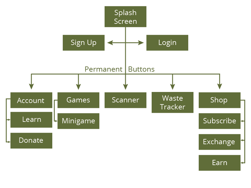
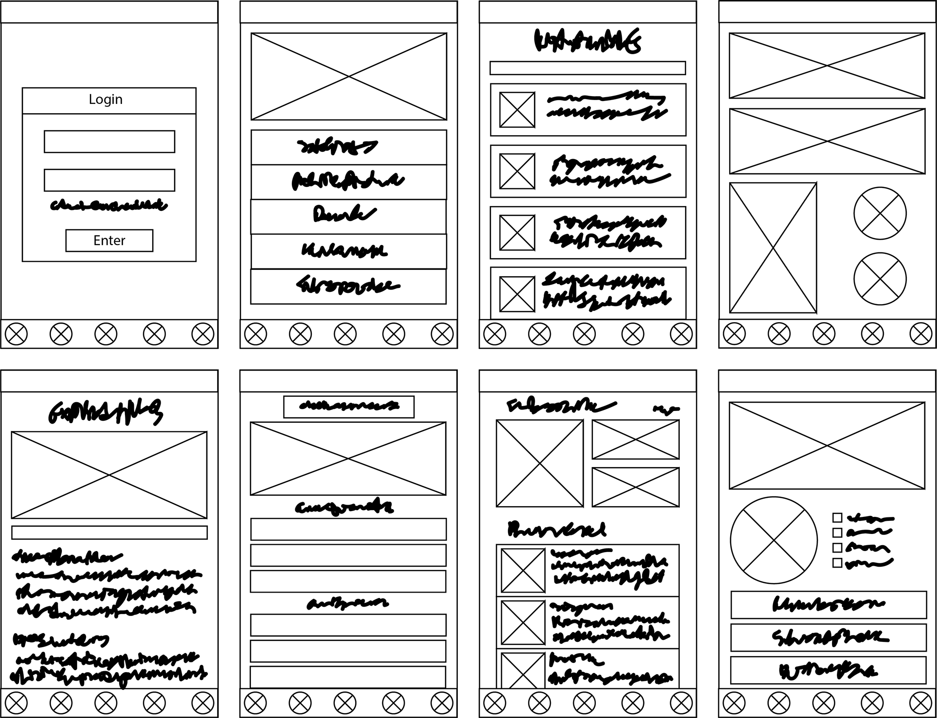
SITE MAPS & WIREFRAMES
Since the educational aspect was the most important to me, I prioritized screens that would push educational use. Once I had those solidified, I added on the standard screens every app has, such as accounts, logins, etc. I created a few different layouts before settling on my final wireframes.
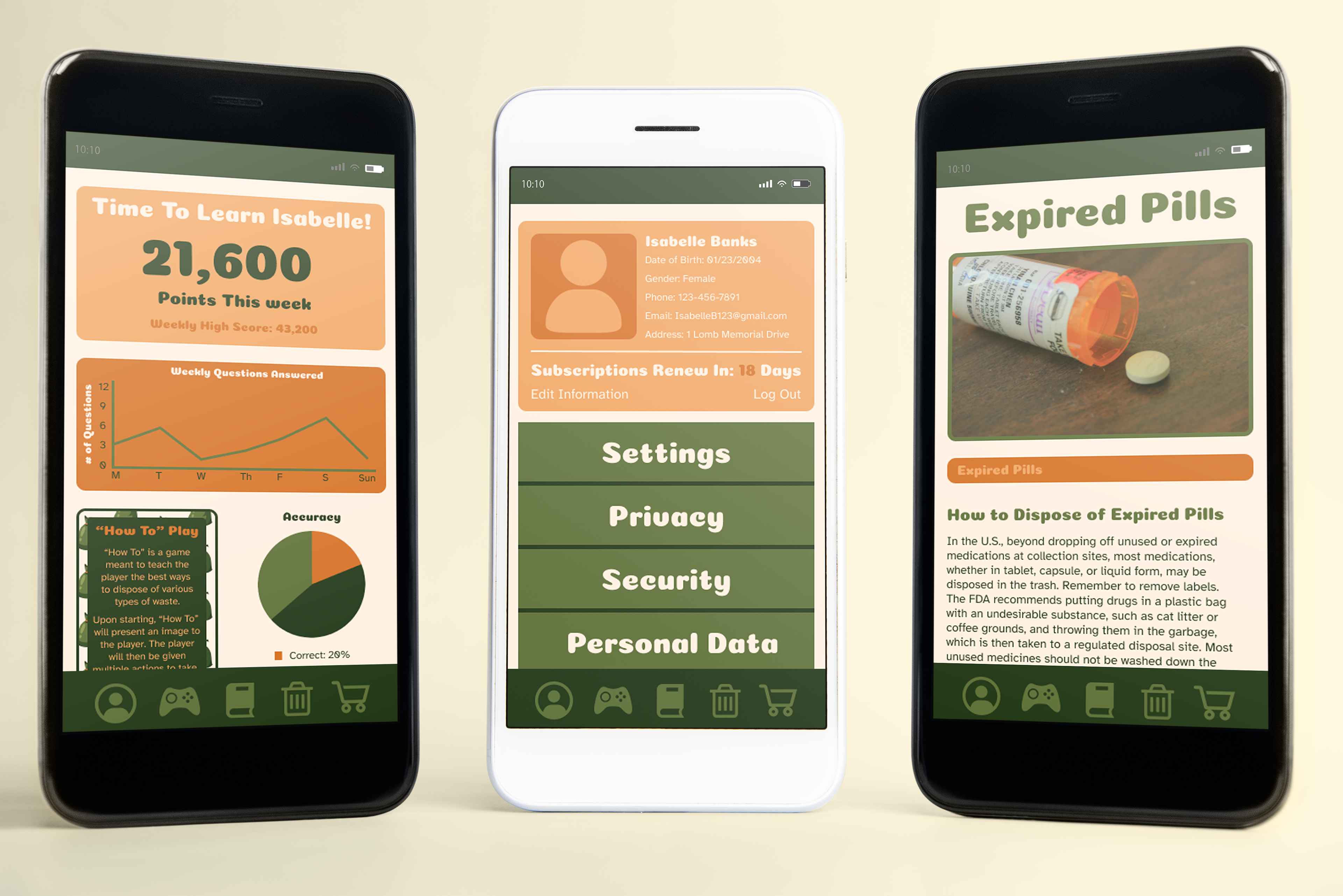
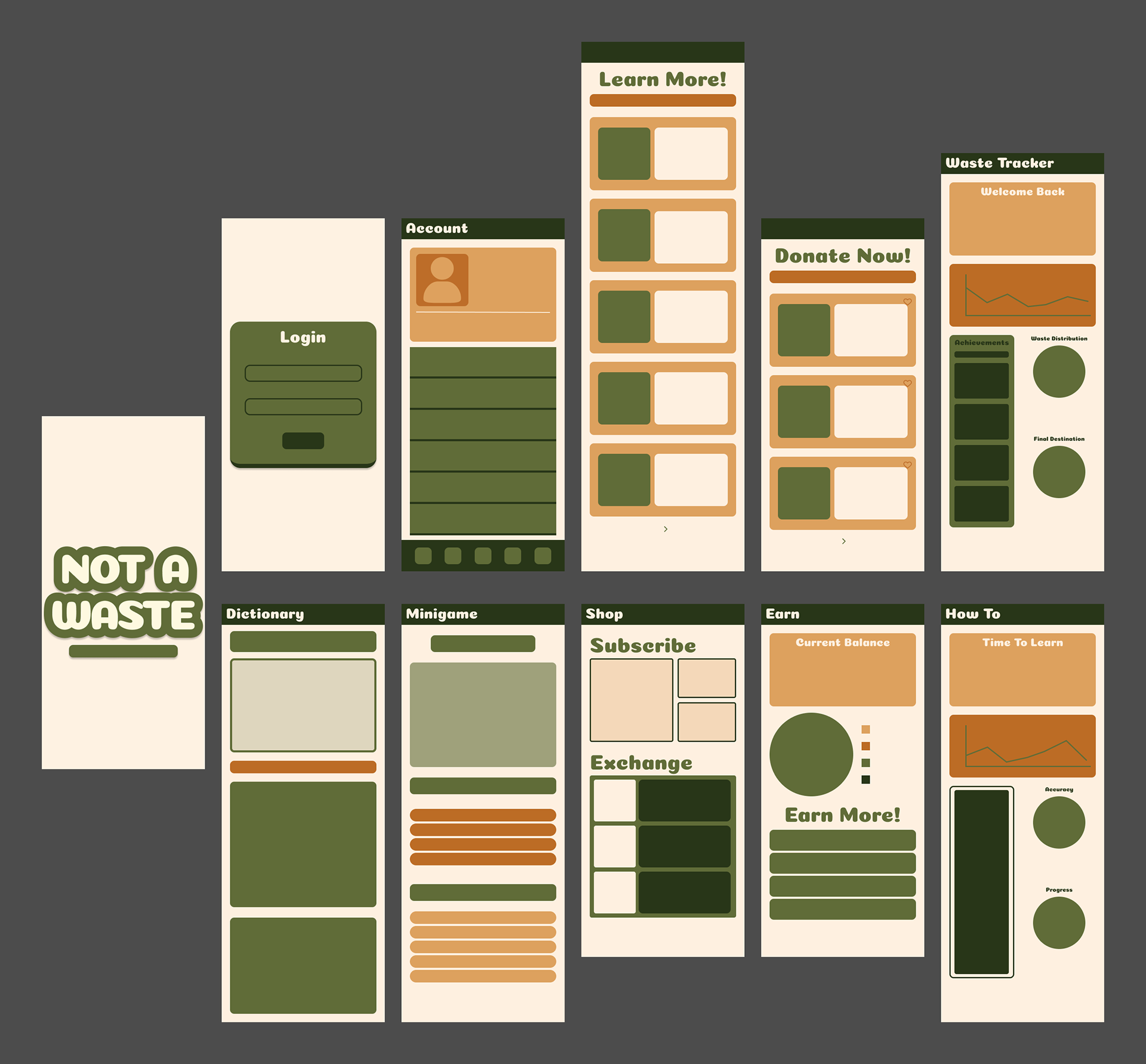
FINAL PRODUCT