FIRST STEPS
PROJECT BRIEF
Design the user experience (UX) for a tableside iPhone application that lets users build and order sandwiches from a deli shop called The Sub Hub or a specialty coffee from a fictitious coffee shop called Perk Me Up. Be sure to pay close attention to the smaller details of ordering.
MY GOAL
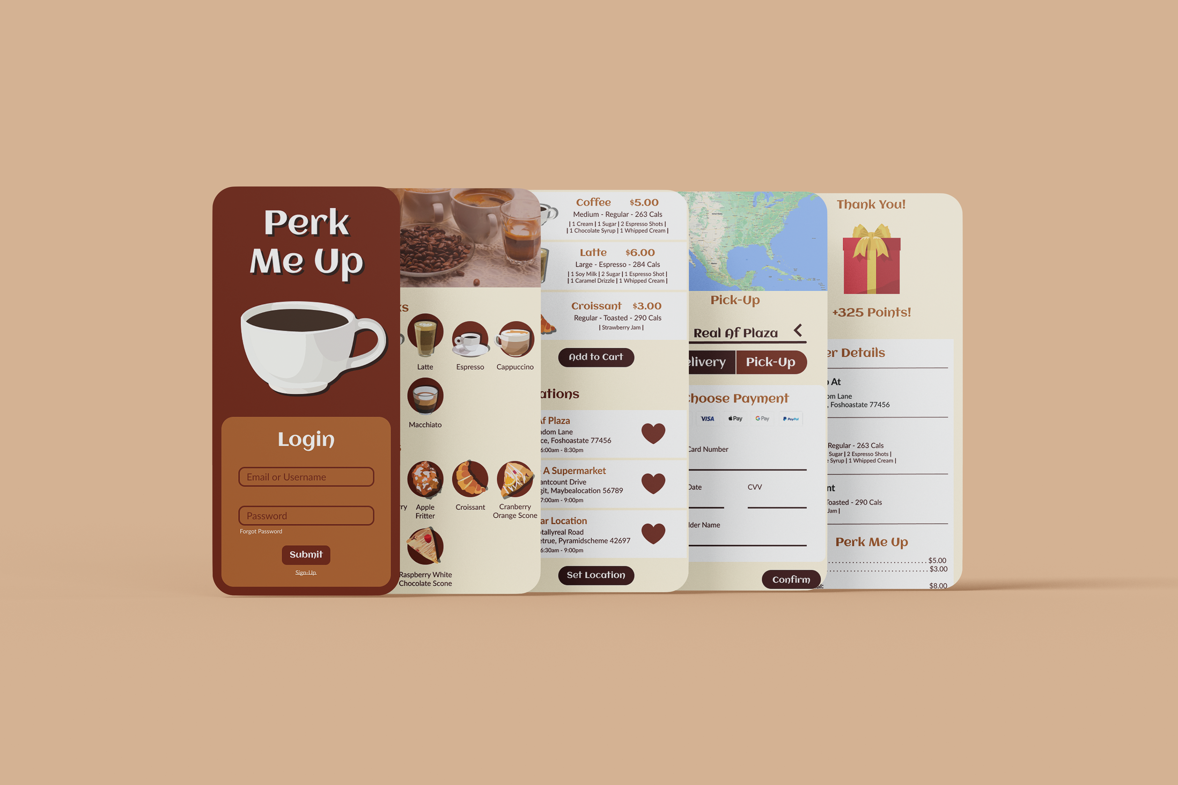
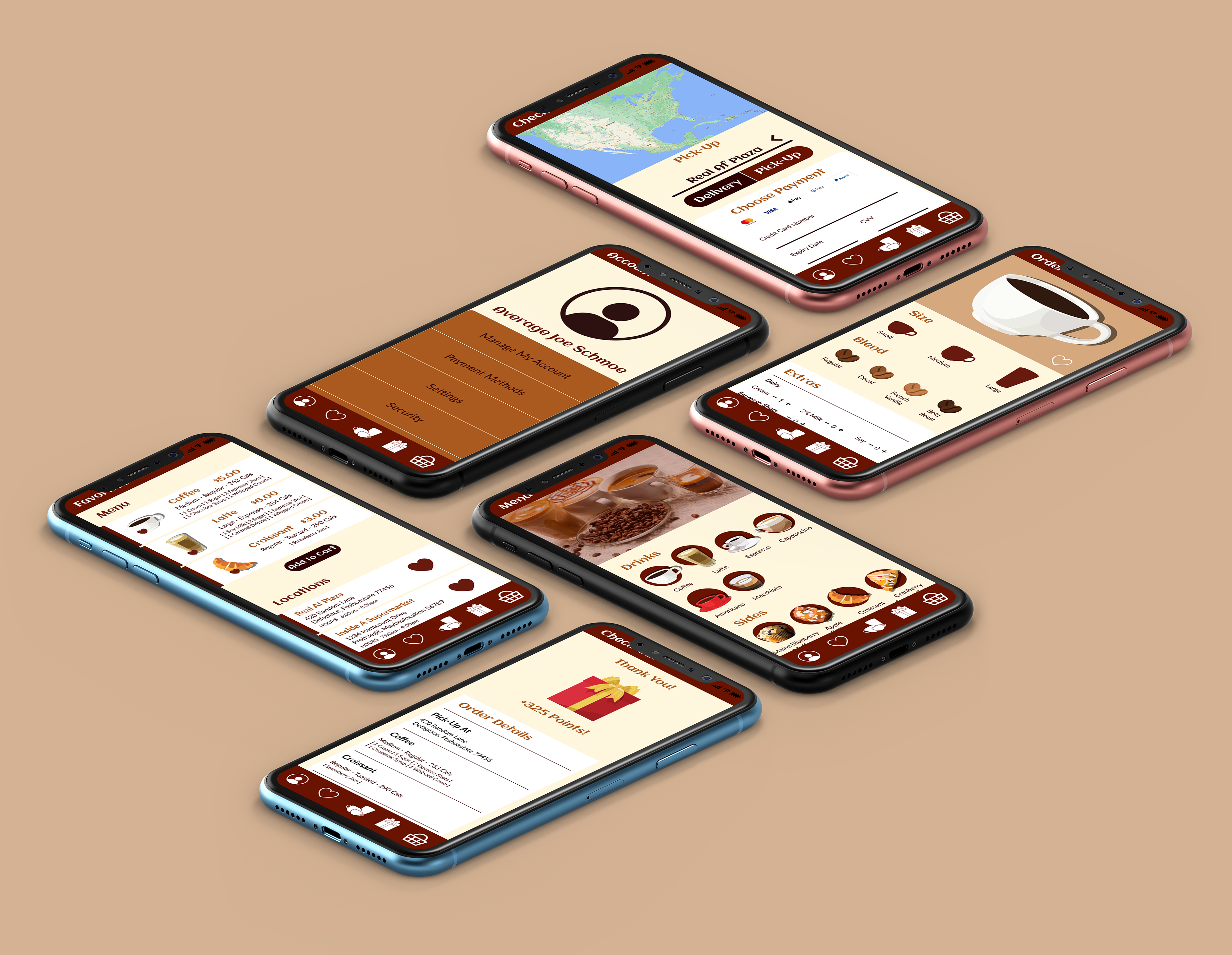
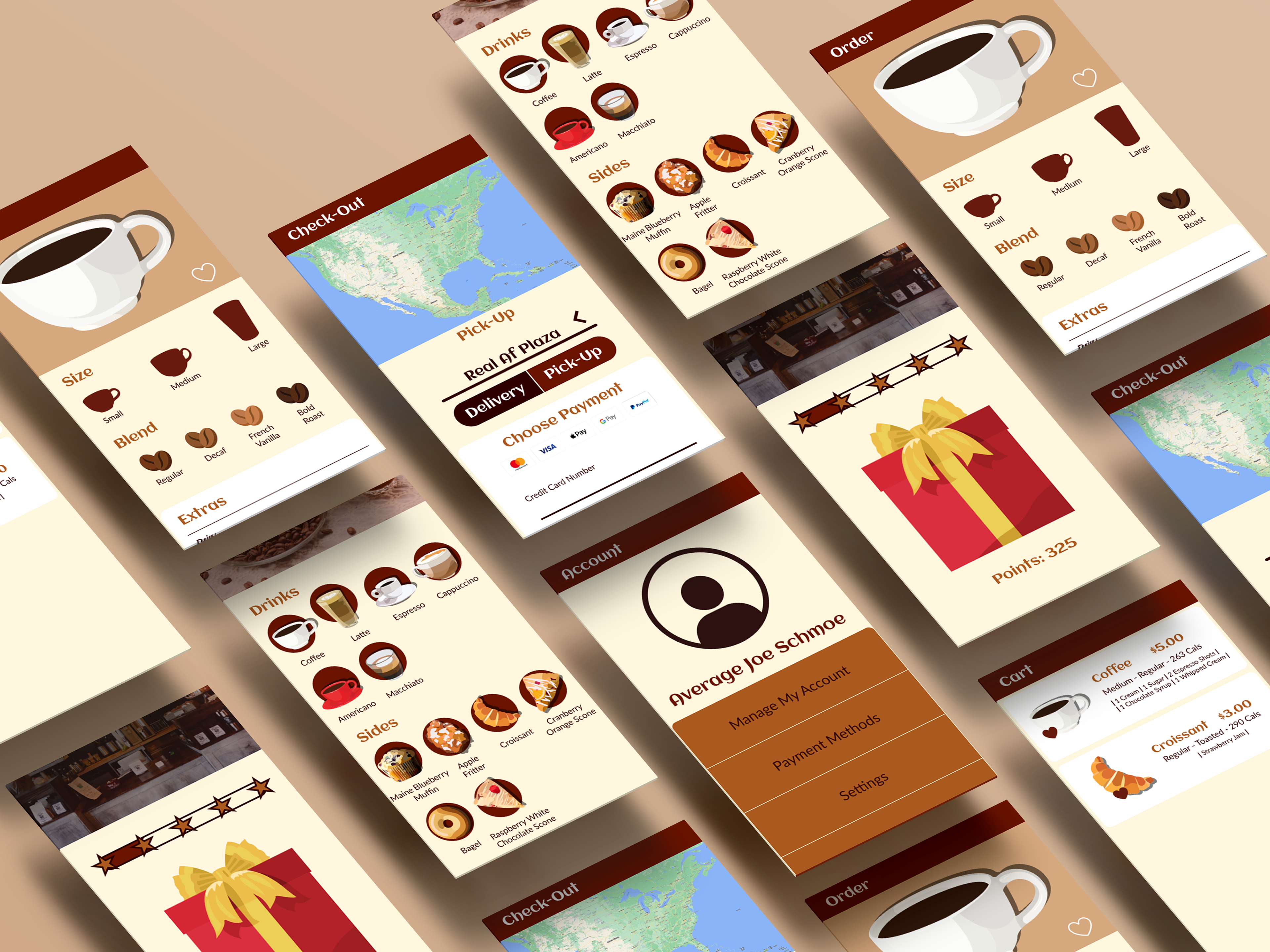
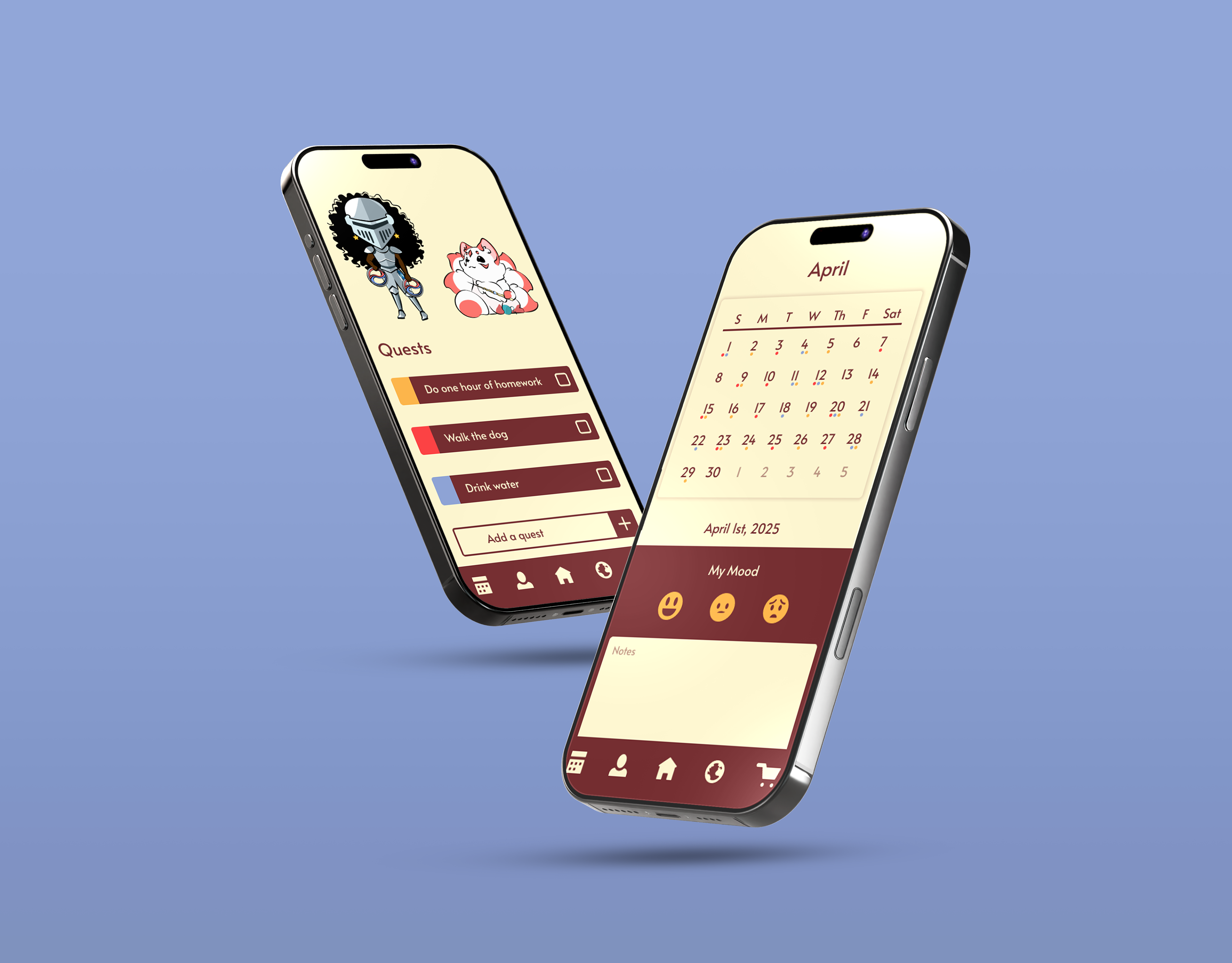
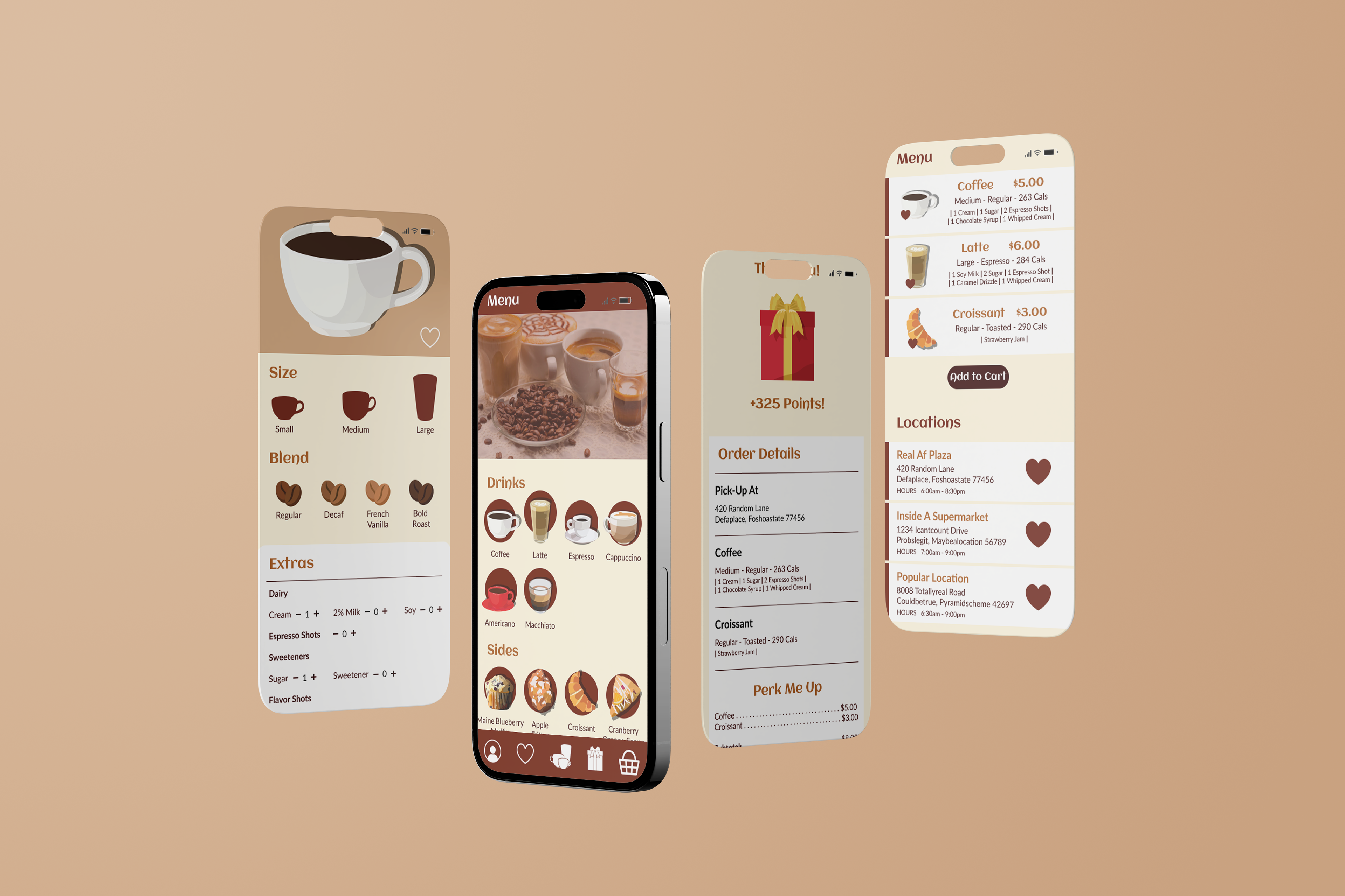
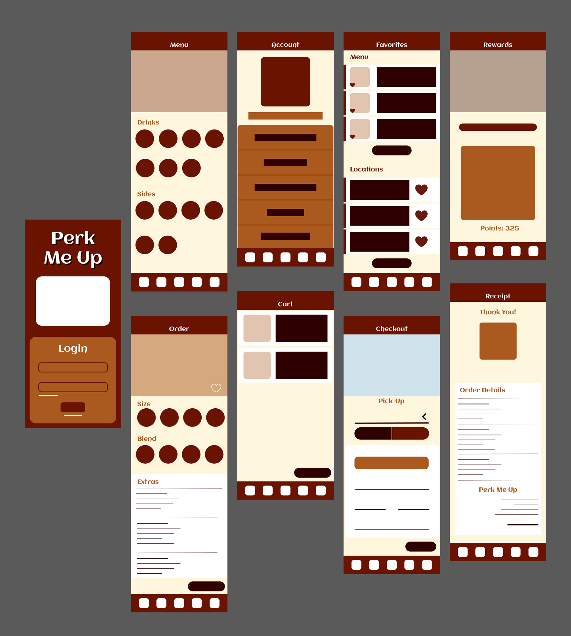
I chose to create an iPhone app for people to order goods from the coffee shop Perk Me Up. I wanted the app to emulate that signature feel of sitting in the corner of a small cafe with a nice hot coffee and an accompanying pastry. It was important for the app to leave the customer with a calm and pleasant feeling. I didn't want the user to feel rushed or frantic about their order. The app should give a comforting, familiar impression.
IDEATION
COMPETITIVE ANALYSIS
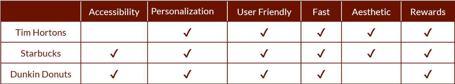
I began by scoping out the competition. Giants in the coffee industry are giants for a reason. I scoured the Mintel Database for papers detailing user statistics for each of their apps. In my competitive analysis, I compared them based on common values within user design. The greatest contributors to success were simple, easy-to-understand interfaces and extensive personalization options. Some of them fell short in accessibility. Important information was designed in a way that didn't take readability or color blindness into account.
COLOR & TYPE
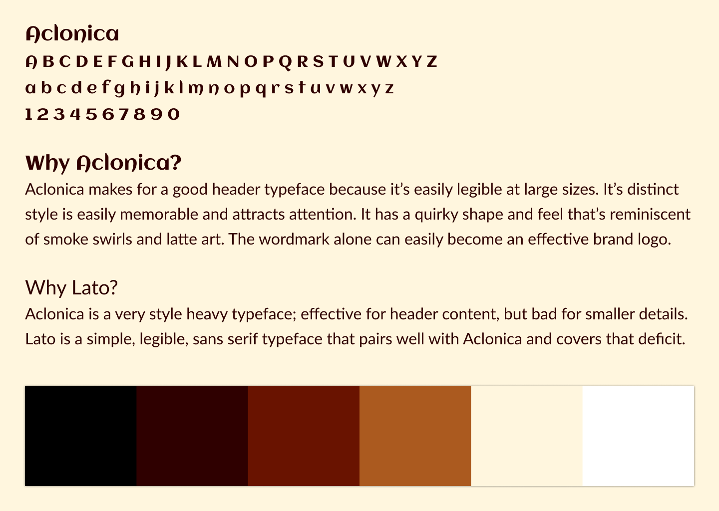
After analyzing the competition and witnessing their accessibility mistakes, I knew I would have to be vigilant in choosing my final typeface and color palette. I did a small type study comparing multiple typefaces to decide on a header style. Eventually, I settled on Aclonica and paired it with Lato to ensure legibility. I picked earthy, coffee tones, trying to avoid super bright colors as I wanted the user to feel relaxed. I chose to skew all the brown tones towards the red end of the spectrum to evoke hunger. I ensured that there would be lighter neutral colors to create high visual contrast between design elements and text. This high visual contrast ensured that even those with color blindness could make out important information.
DEVELOPMENT


USER PERSONAS
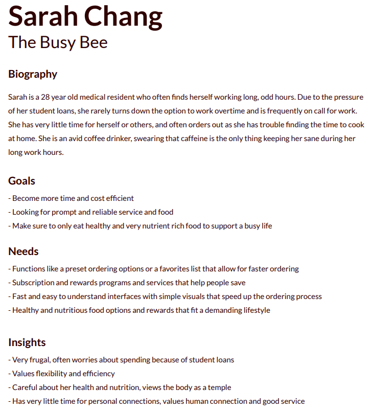
To create a good app, you must first consider the people using it. To do this, I found an in-depth research paper from the Mintel Database outlining the user base and common consumers of cafes and coffee shops. With this information, I created two user personas to represent the traits of common demographics. One was significantly more focused on functionality, while the other valued aesthetics. Considering these needs helped direct my design.
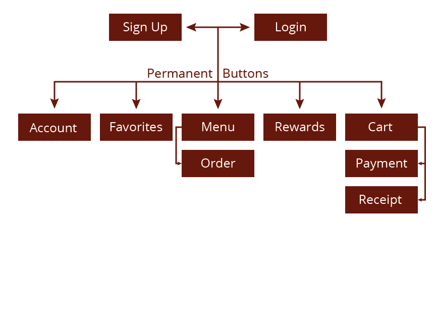
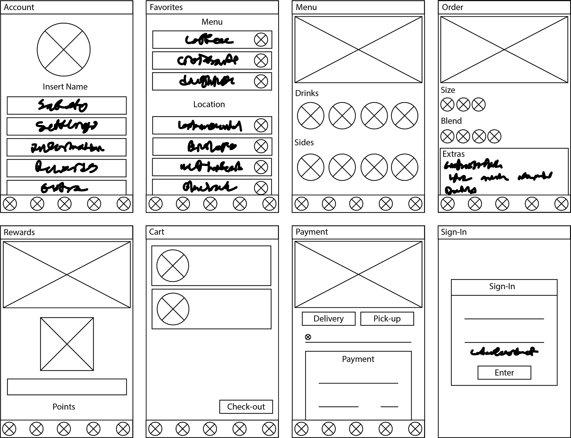
SITE MAPS & WIREFRAMES
I began with basic sketches, focusing mainly on graphic elements and iconography to establish the style and atmosphere I wanted the app to use moving forward. Then I delved into site mapping, using research to establish what screens would be necessary to enhance the user experience. After that, I developed and finalized my wireframes as the skeleton for my designs.
Final PRODUCT