FIRST STEPS
PROJECT BRIEF
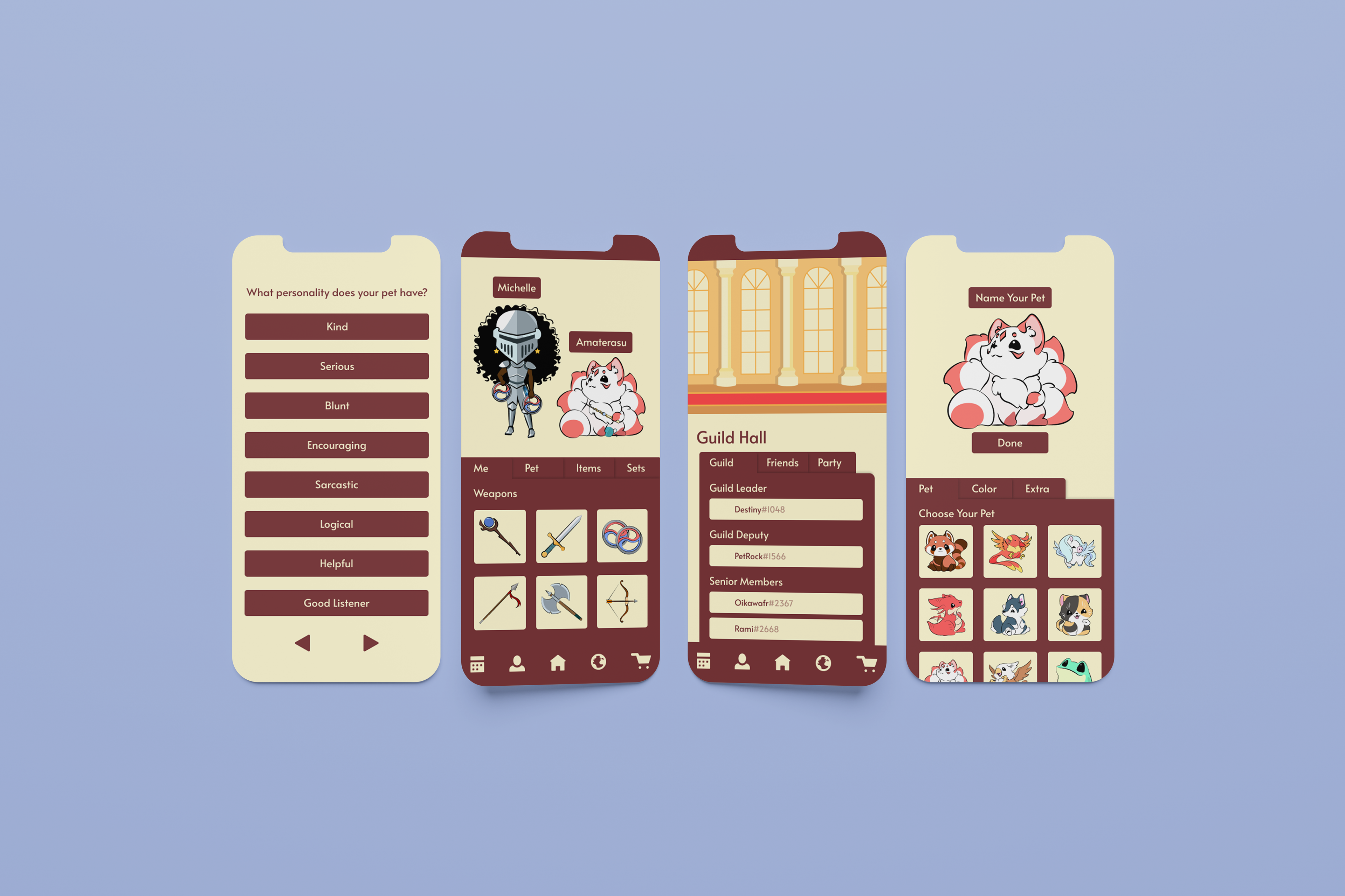
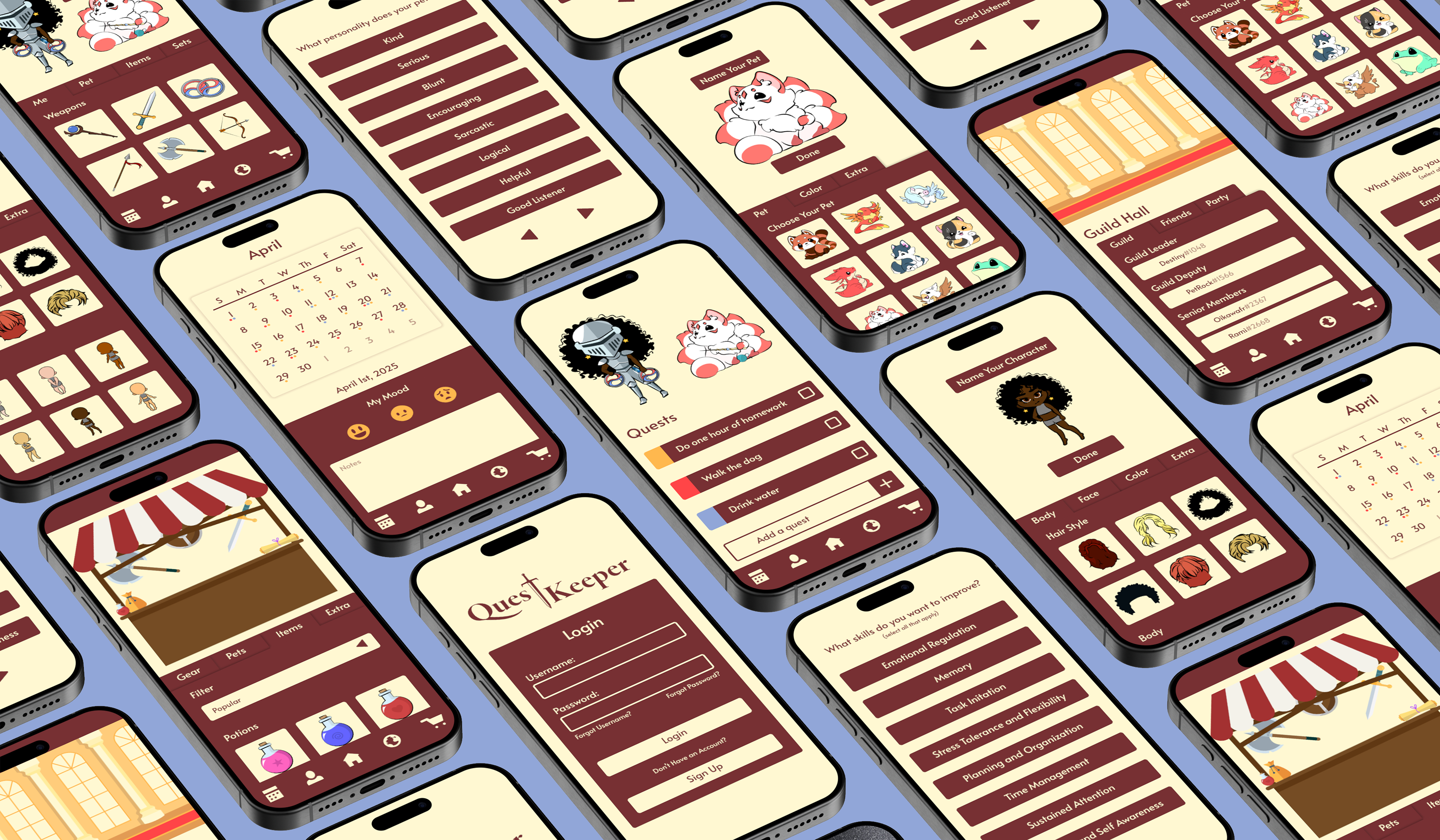
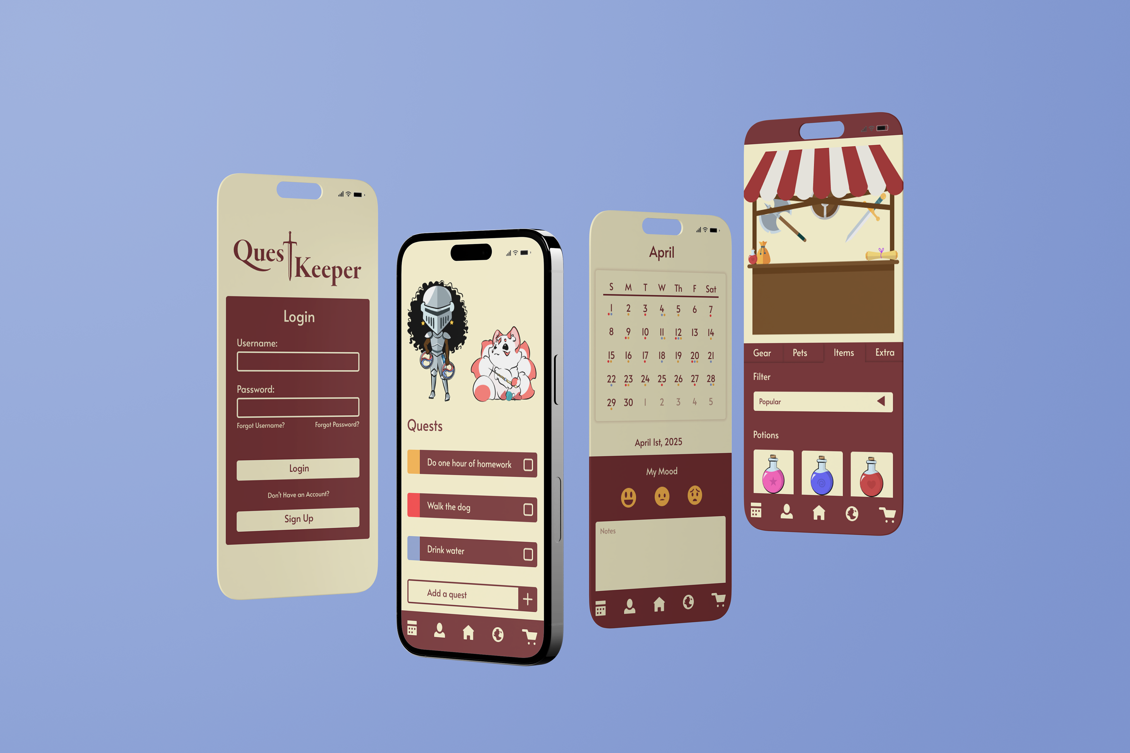
This project is my Graphic Design Capstone. We were not given any specific prompt. Instead, we were told to come up with a project on our own. So the final project for my major combined my love of UI/UX Design with my own lofty wish. "My reason for designing is to bring attention to those who are forgotten." Questkeeper is a fully prototyped app that took roughly a year to create. It aims to provide those with executive dysfunction the tools they need to regain control of their life.
IDEATION
RESEARCH
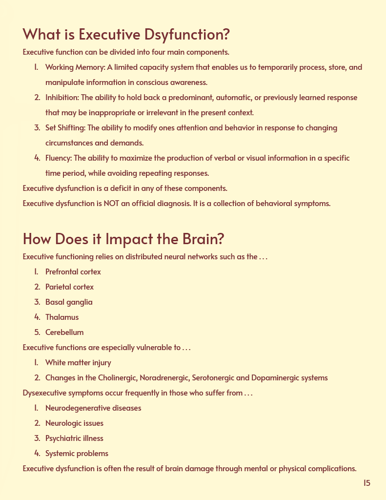
Initially, I consulted various Psychology Professors, hoping they would be able to answer my questions on executive dysfunction or recommend other sources to me. With their insight, I was able to gain a formidable amount of information. The important bits can be summarized as follows. Executive dysfunction is a symptom, not a disorder itself, it is roughly defined as a lack of basic executive skills that allow people to function normally. Therefore, my app needed to facilitate the improvement of these executive skills to help people overcome their executive dysfunction. In order to do this, I realized I would have to gamify my app. People needed to enjoy the experience; it couldn't feel like a chore, or else it would become yet another difficult-to-execute task in an already growing pile.
COLOR & TYPE
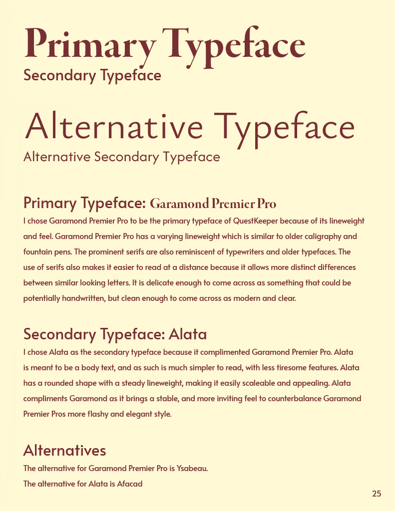
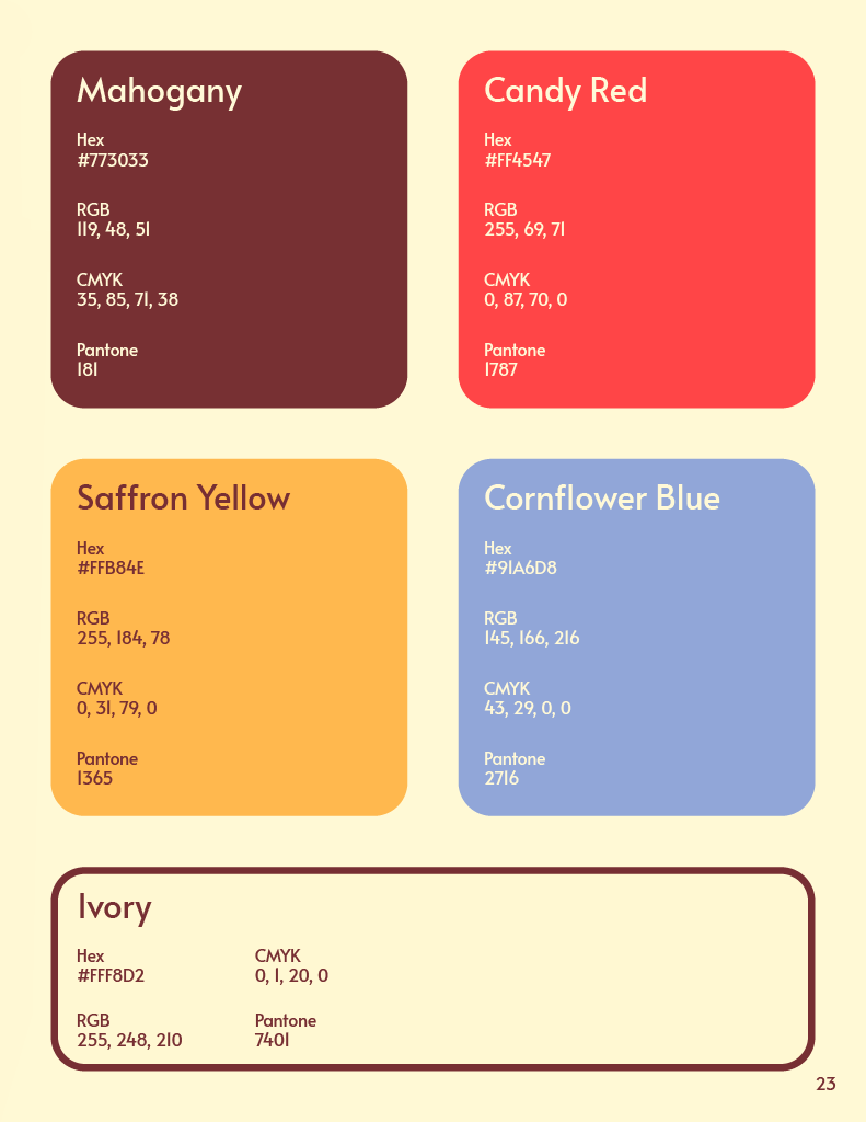
Knowing that I would have to gamify the experience, I immediately turned to the concept of questing, and the hero's journey common in all storytelling media. I wanted the app to emulate the feeling of a good old-fashioned adventure. An epic quest, with a knight, a wizard, and probably a dragon or two. In order to set that tone, I decided early that my palette would revolve around a dark and rich red, reminiscent of old European royalty. I chose ivory as a neutral to complement it and decided on the remaining colors as "key" colors, which would represent specific applications or features of the app. Keeping with the theme of questing, I chose Garamond Premier Pro as it looked similar to writing done with a quill and ink, but was still clean enough to be easily legible. I paired it with Alata, as I needed a stable and easy-to-read secondary typeface.
DEVELOPMENT
LOGO & SCREENS
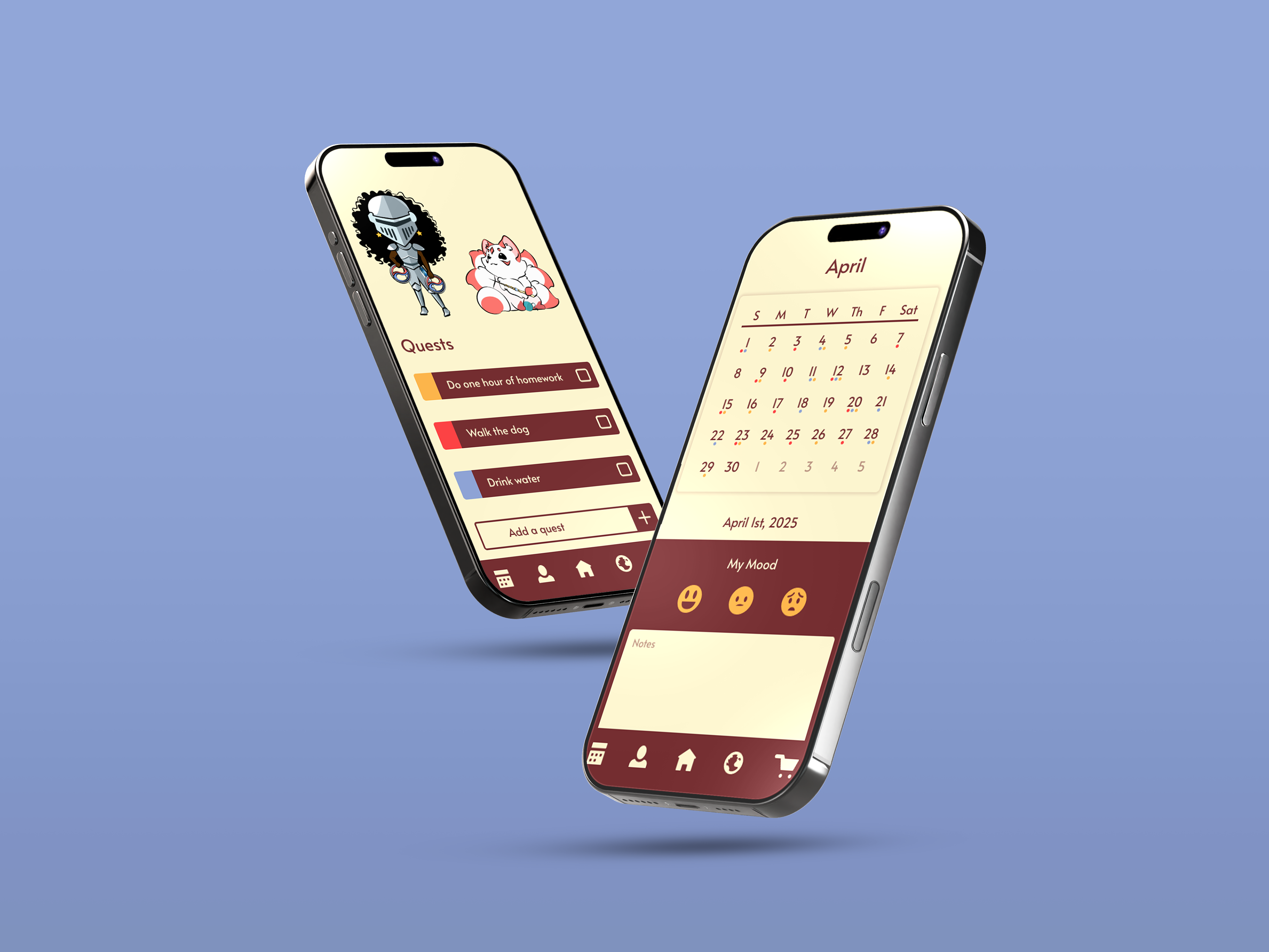
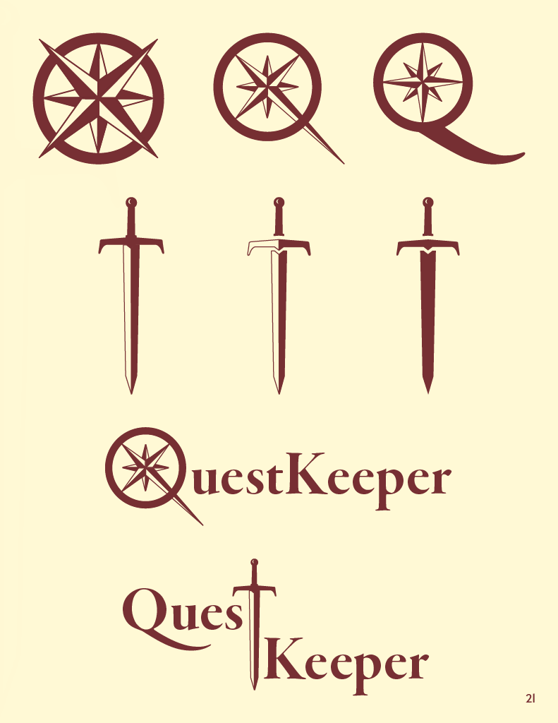
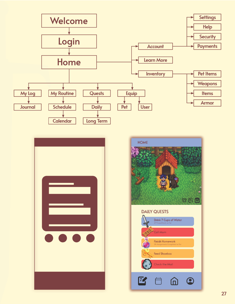
Since I had limited time for such a large-scale project, I focused mainly on screens that emphasized the gamification aspect of the app. I prioritized developing game elements such as the Questing system, Guild aspects, Pet care, and more. I also worked to develop the app's overall identity. Creating a logo and a specialized login screen. The logo was developed with the intent to keep the concept of adventure close. In the end, more complicated logo structures were discarded for simpler icons that were easily scalable.
FINAL PRODUCT
CLICK HERE TO EXPERIENCE QUESTKEEPER